Grover
Location
Berlin, Germany
Deliverables
Brand Refresh, Creative Direction, UX Research, Digital & Print Design.
Industry
Technology, Circular Technology, Fintech
Year
2016
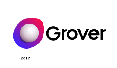
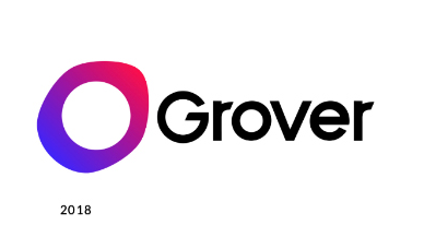
No contract. No minimum term. More freedom. Rent with Grover & enjoy the charm of new tech every month. 1,3,6,12 month plans. 1500+ products. Flexible monthly rental. No contract, No deposit. No full price payment. Eco-friendly. 90% insurance coverage. It sounds great right? This is the Grover logo as long as we managed and redesigned the brand between 2016 and 2018.
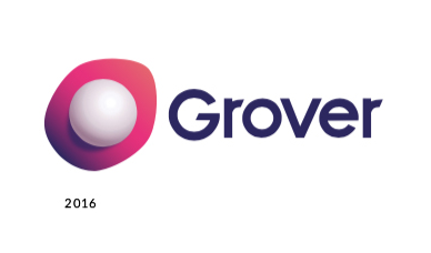
This is the brand manual we received in 2016 from a New York-based agency. And this was what we started with.
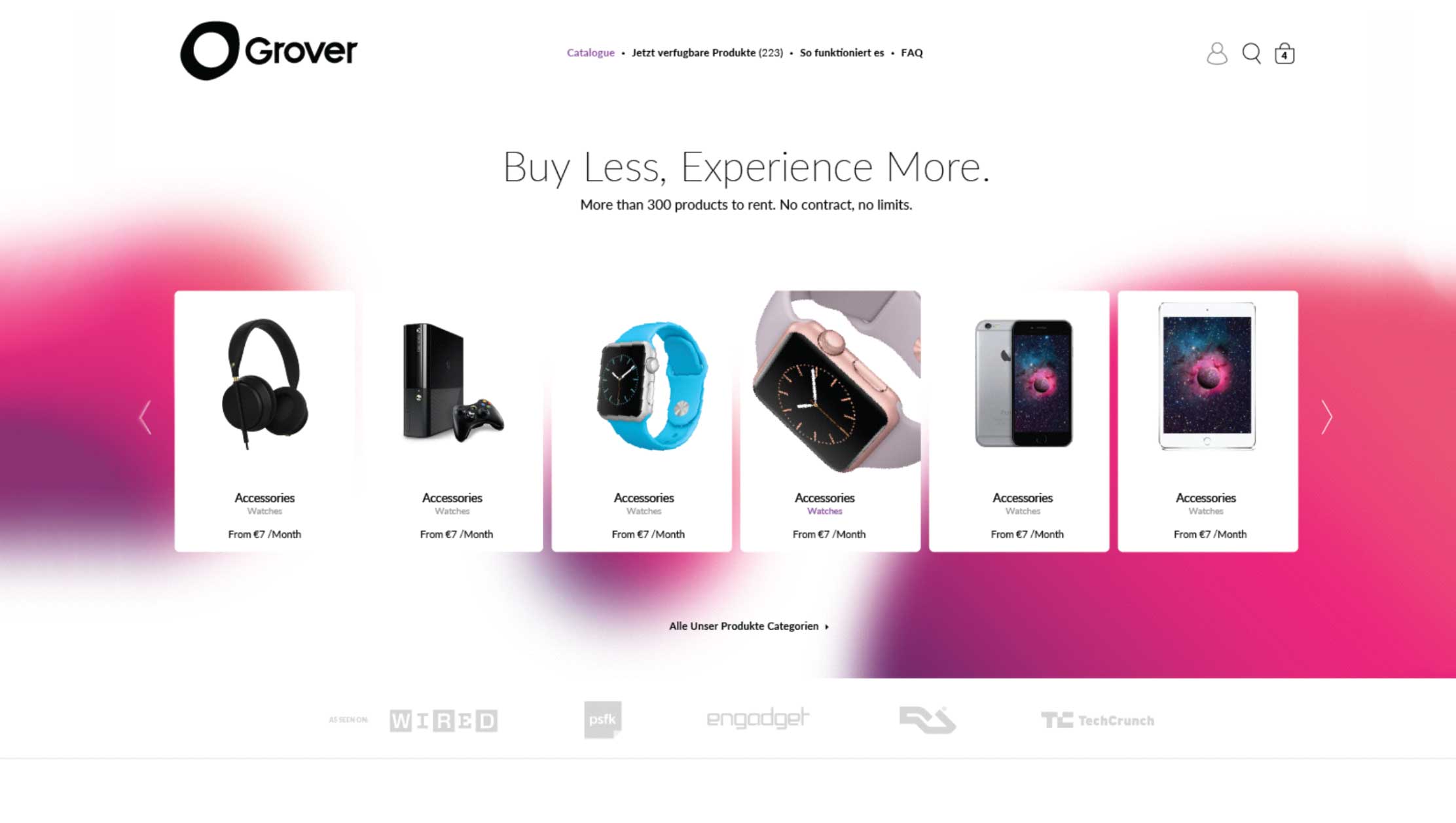
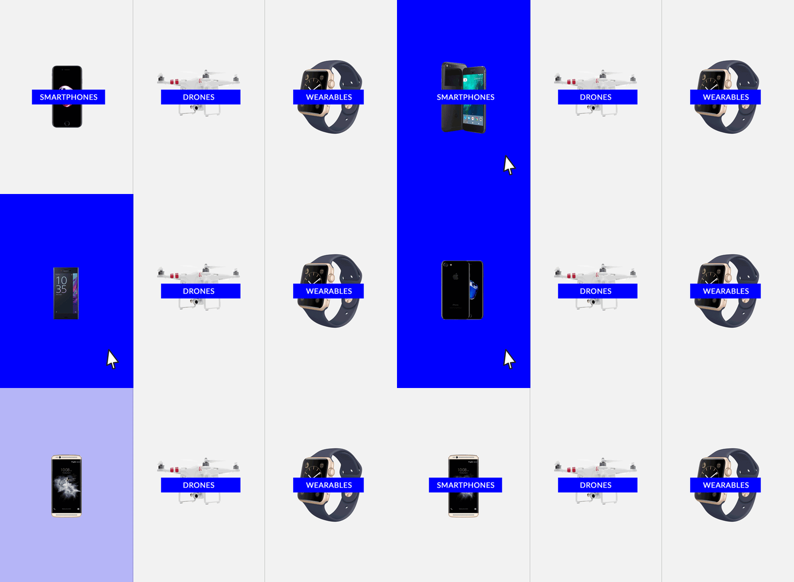
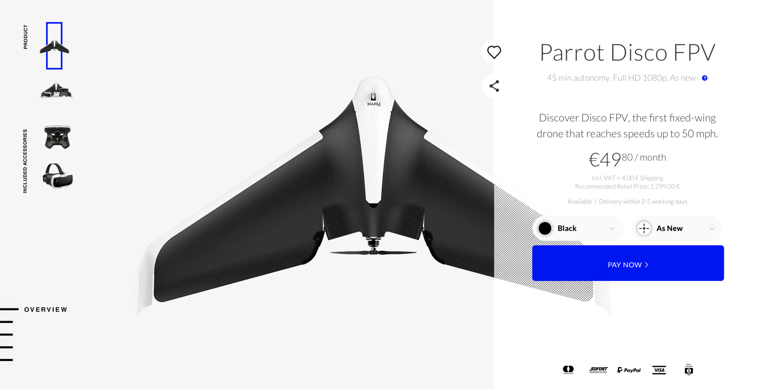
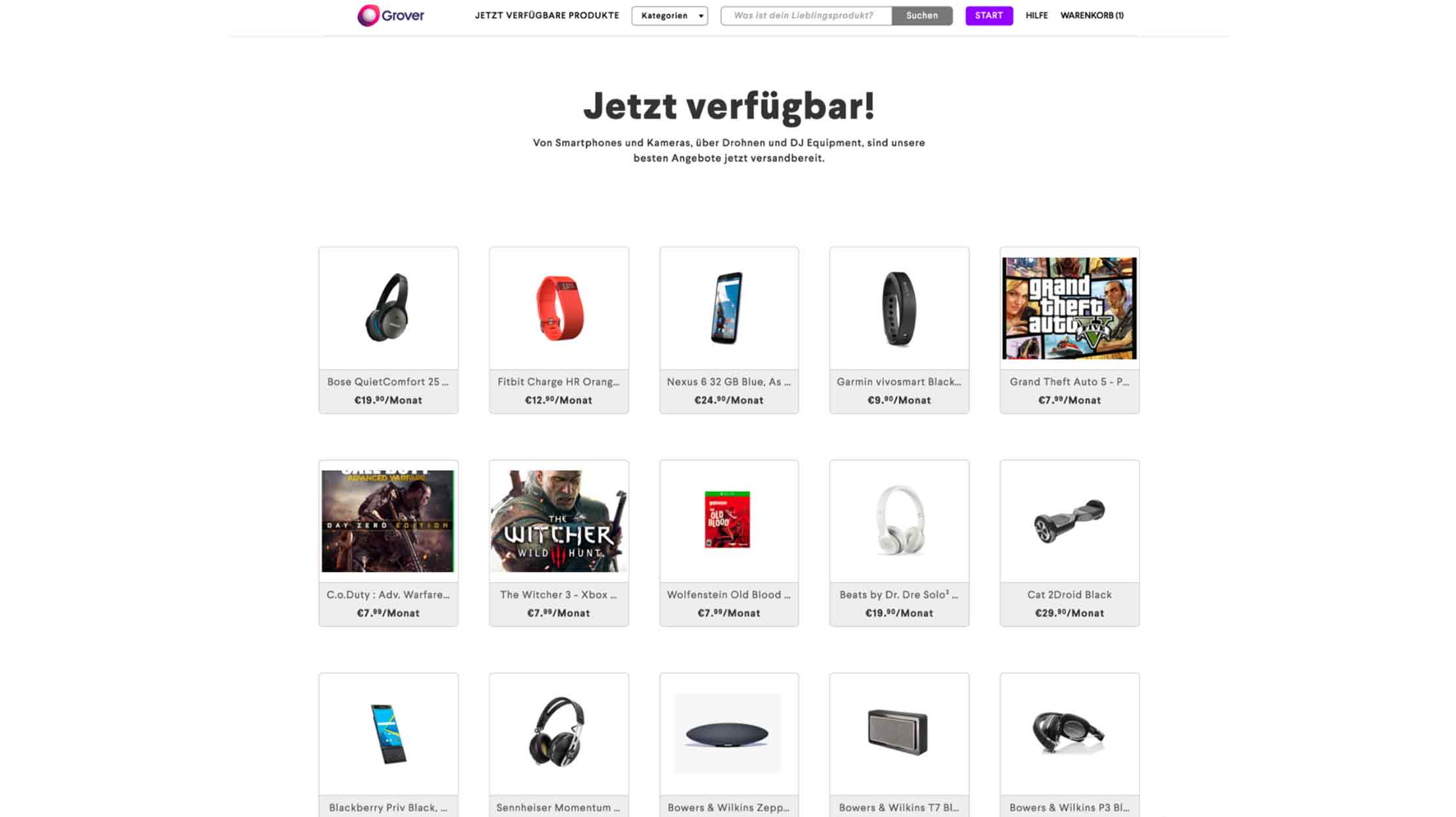
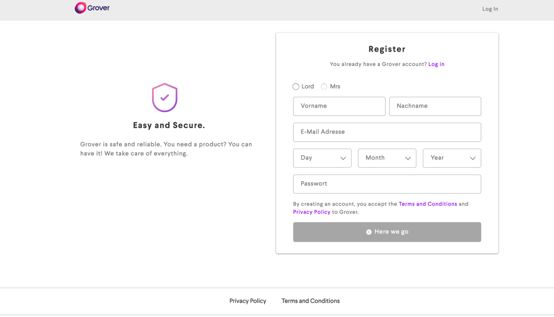
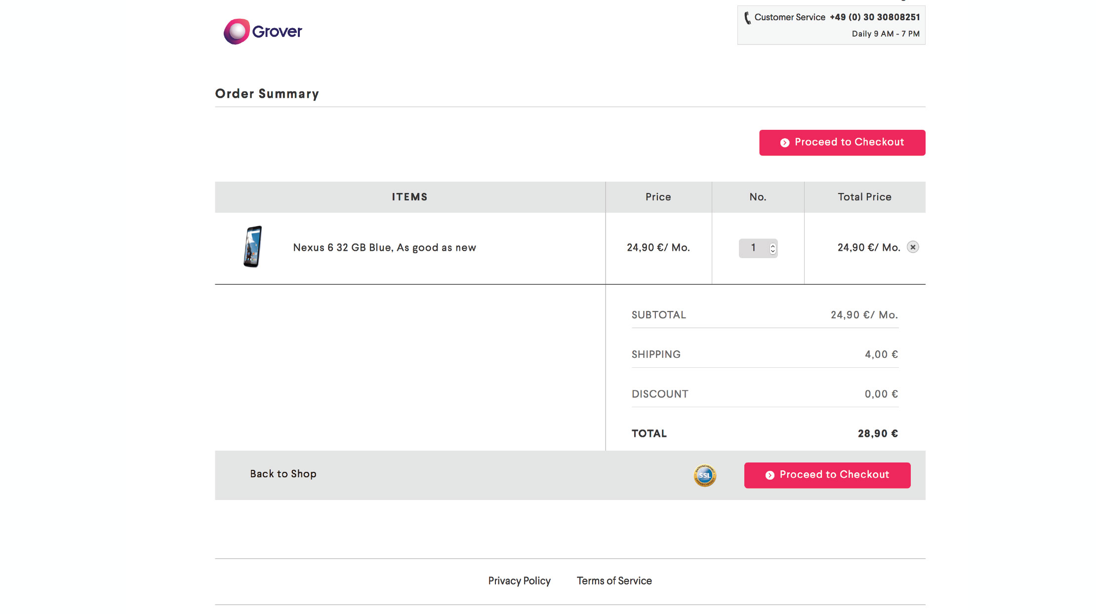
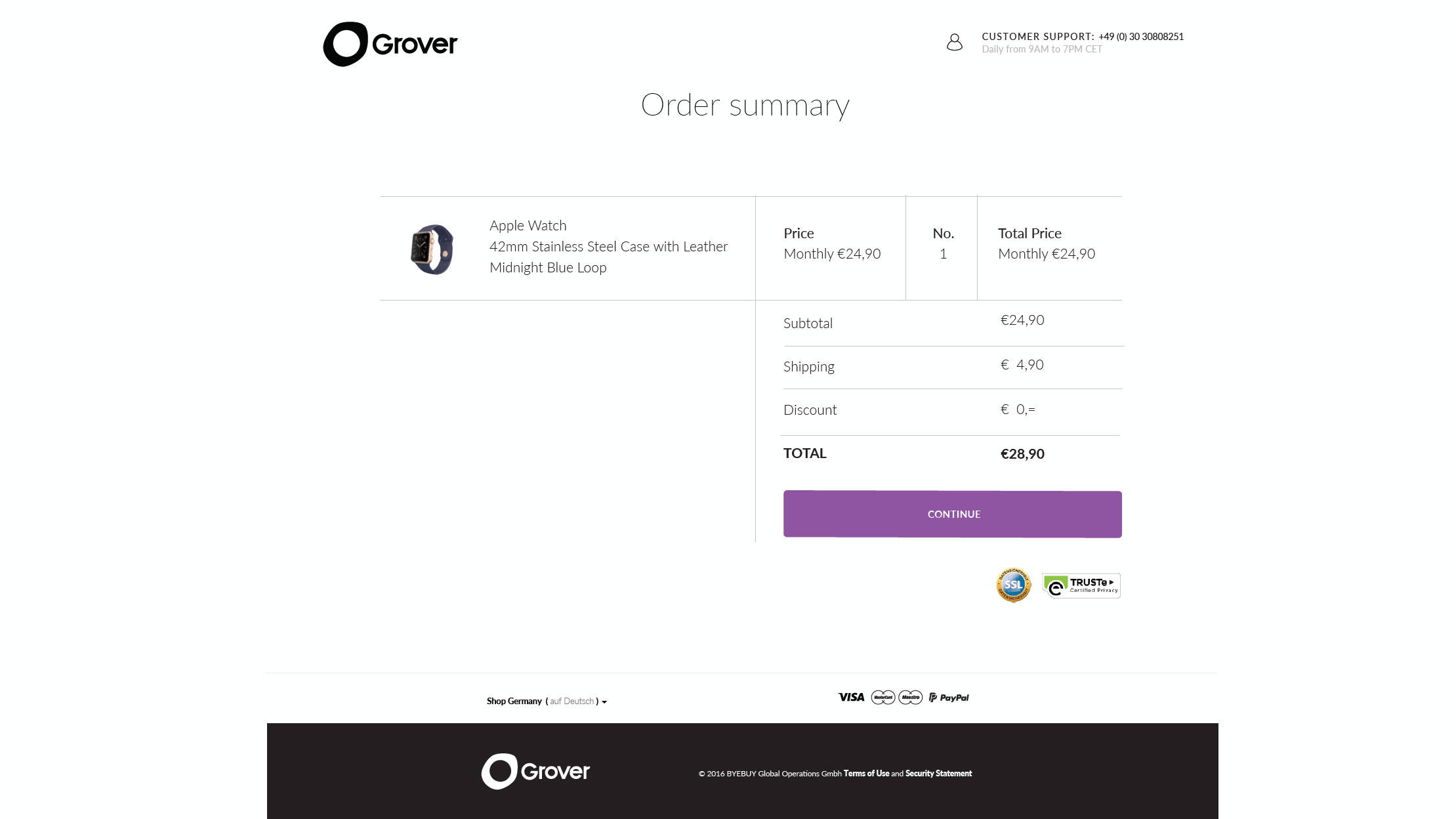
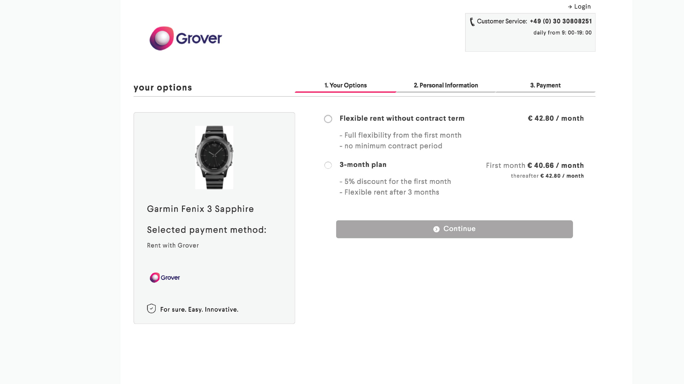
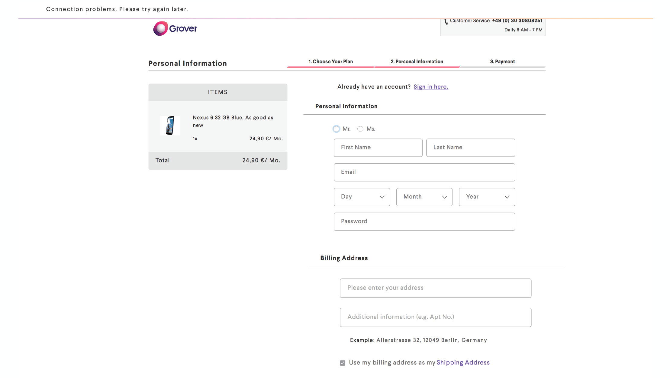
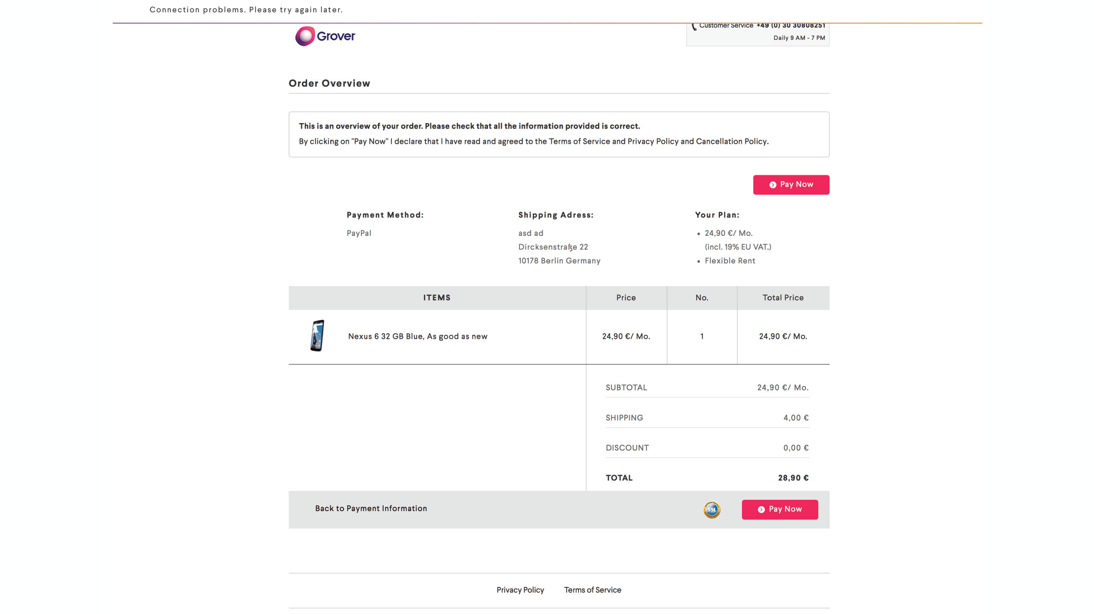
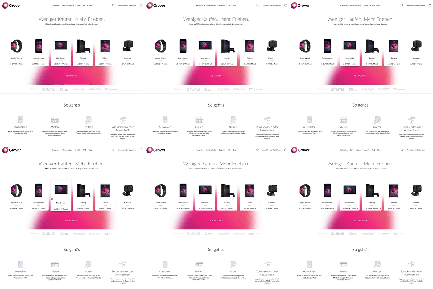
And our product, the shop and the website were looking like this. The main issue is that it had a lot of conflicts and a lot of bugs, over 16000 lines of code in the css front-end. We had to assess and take some decisions together with the development team. Change, update, redesign, cut down the development team on debugging, but in the same time keep the project live, as it had already few hundred of daily conversions.
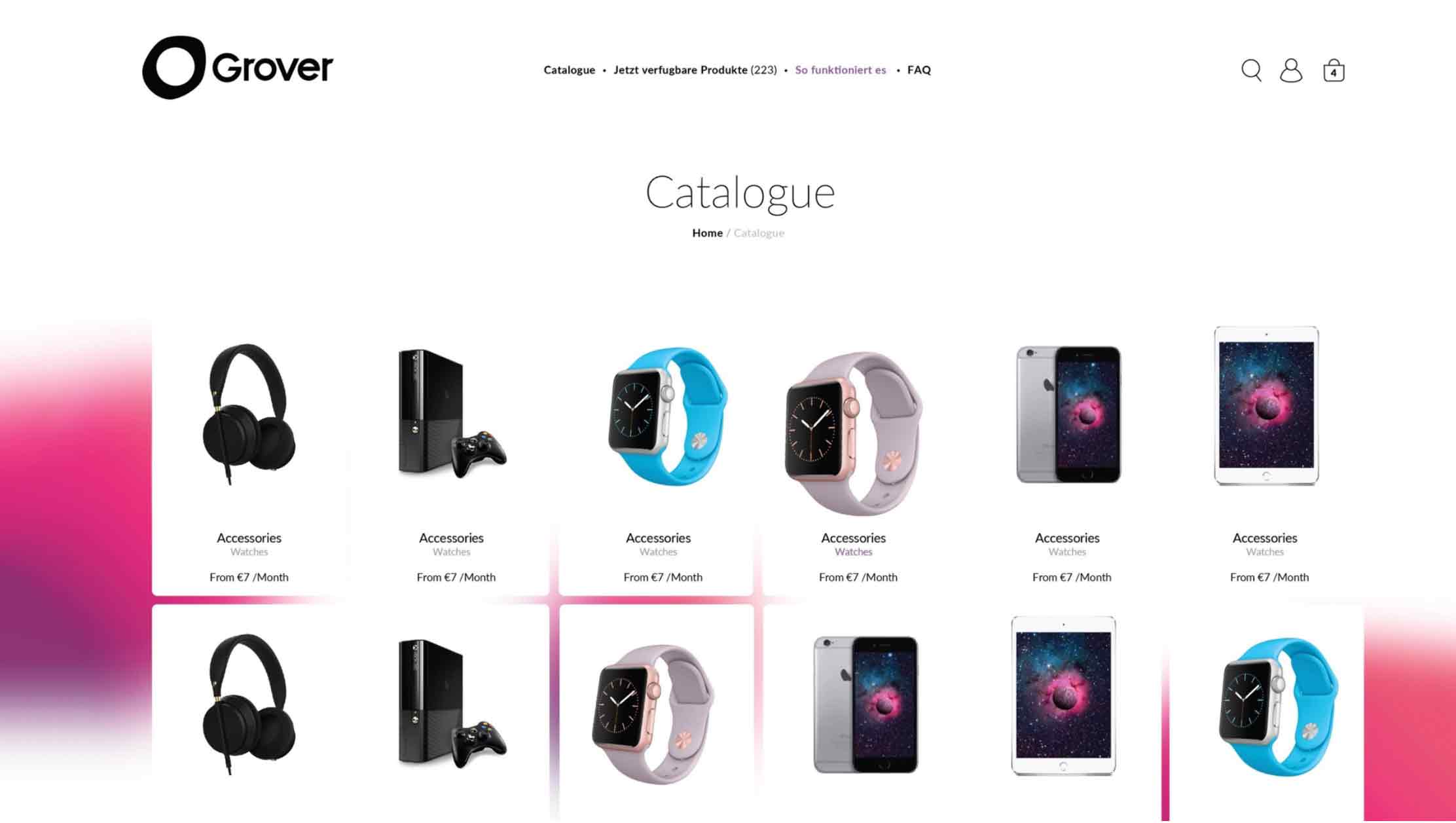
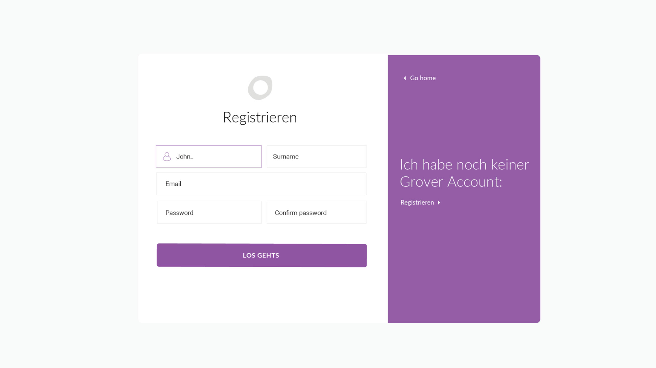
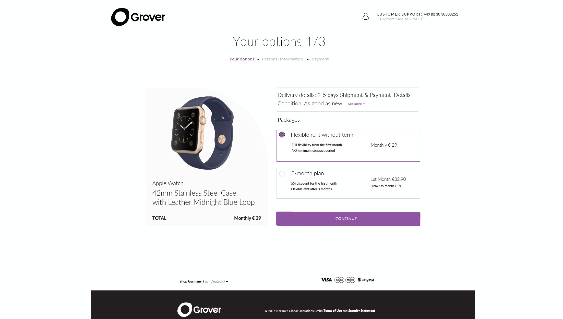
These were the quick fixes. We redesigned the sensitive areas and created really nice coded libraries and from there it was really easy to replace atomicly elements in pages, then parts of pages, then entire pages and in the end make everything reliable, secure and responsive.
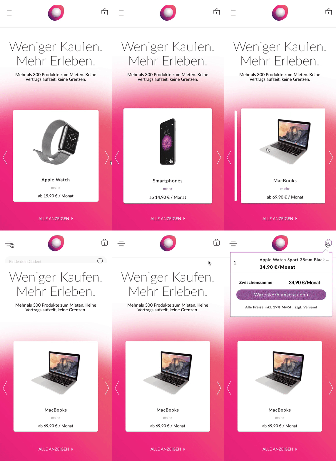
And then other parts of the project. We started by building a brand library. We decided to work with purple as it is a noble and clear distinctive color for finance. We were aiming to have some special Rent with Grover buttons, similar as Pay With PayPal.
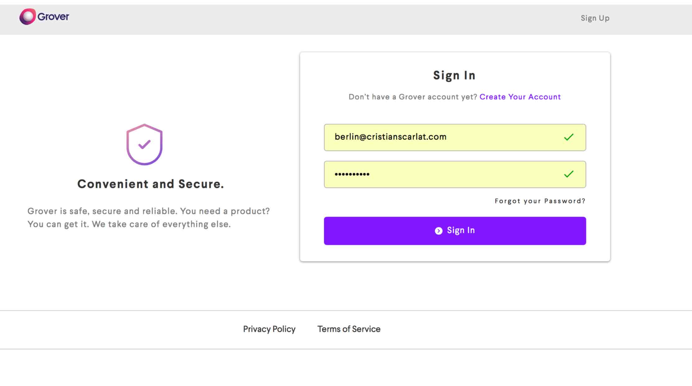
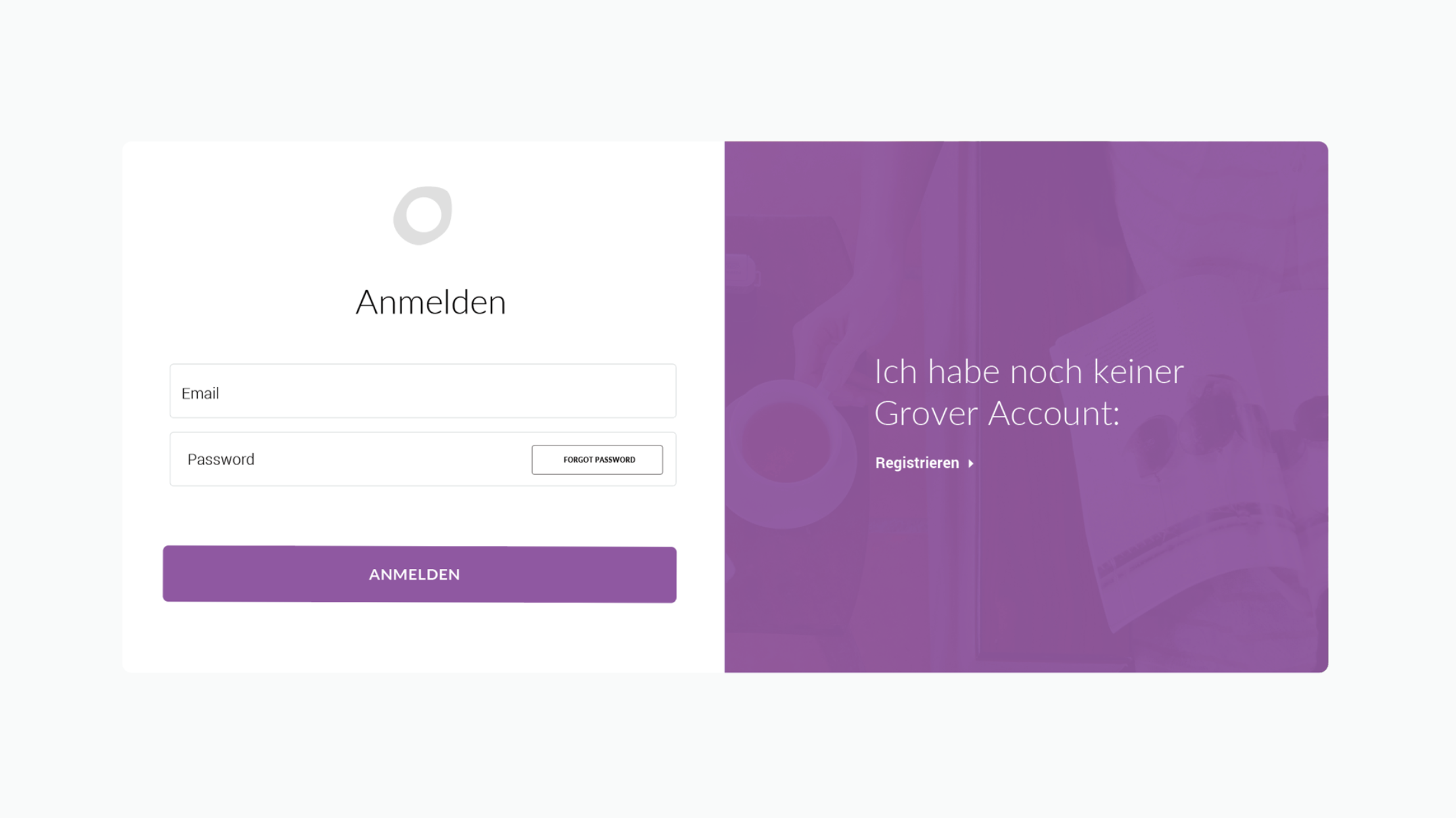


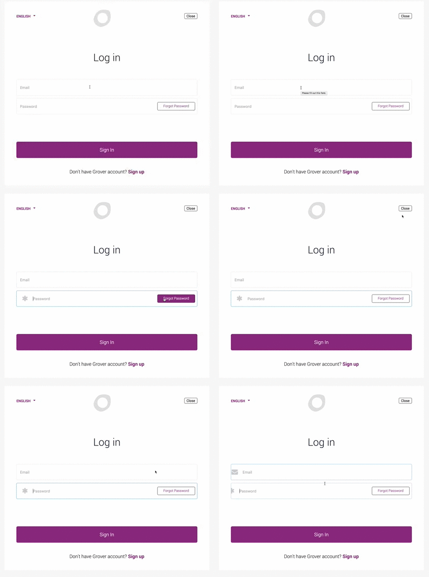
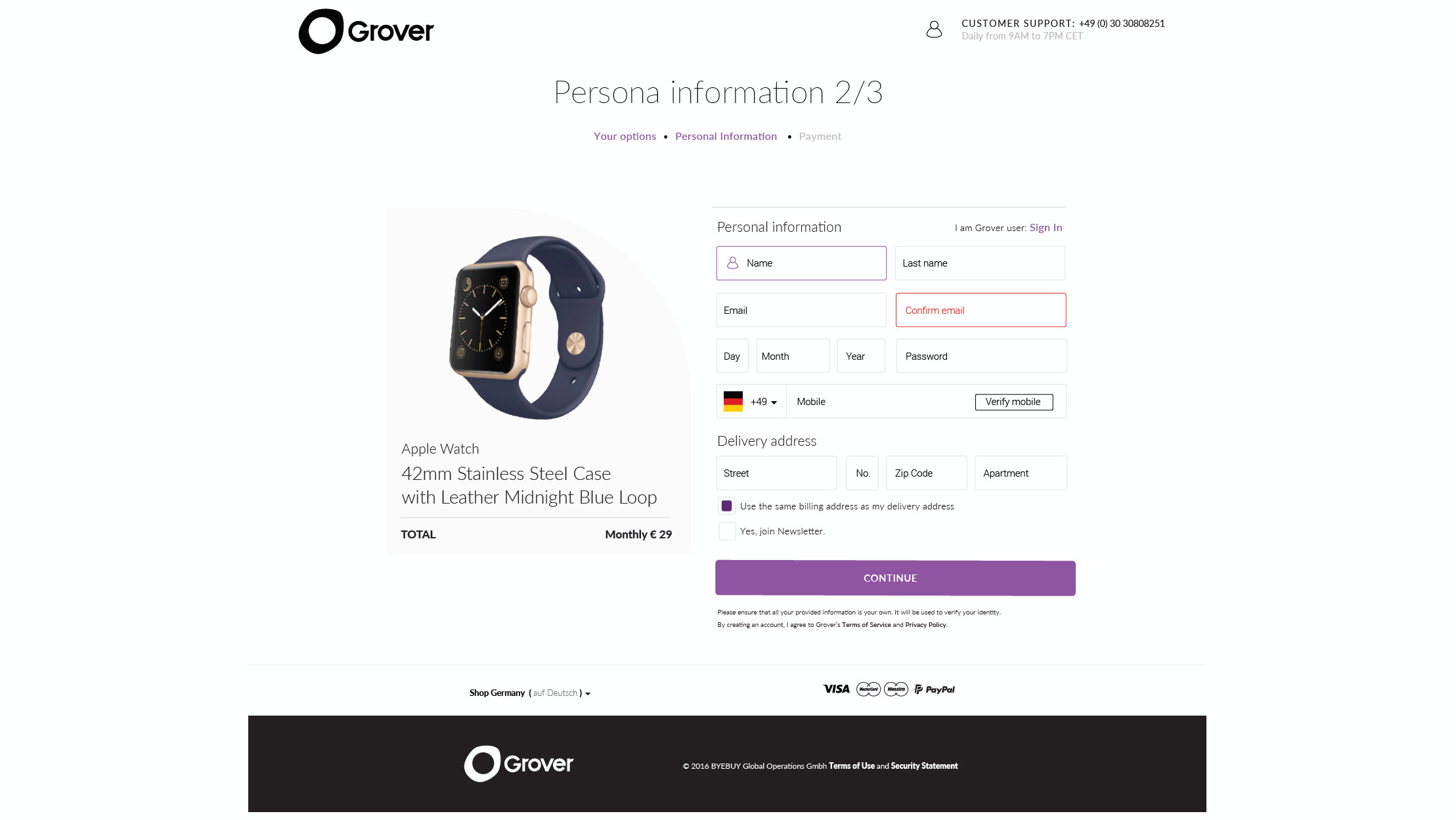
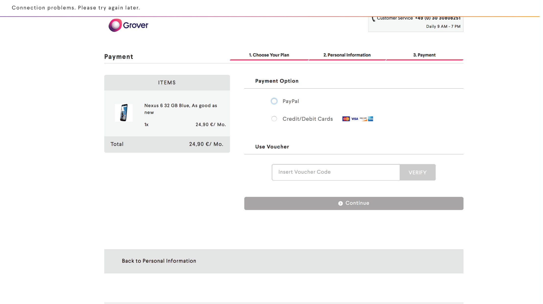
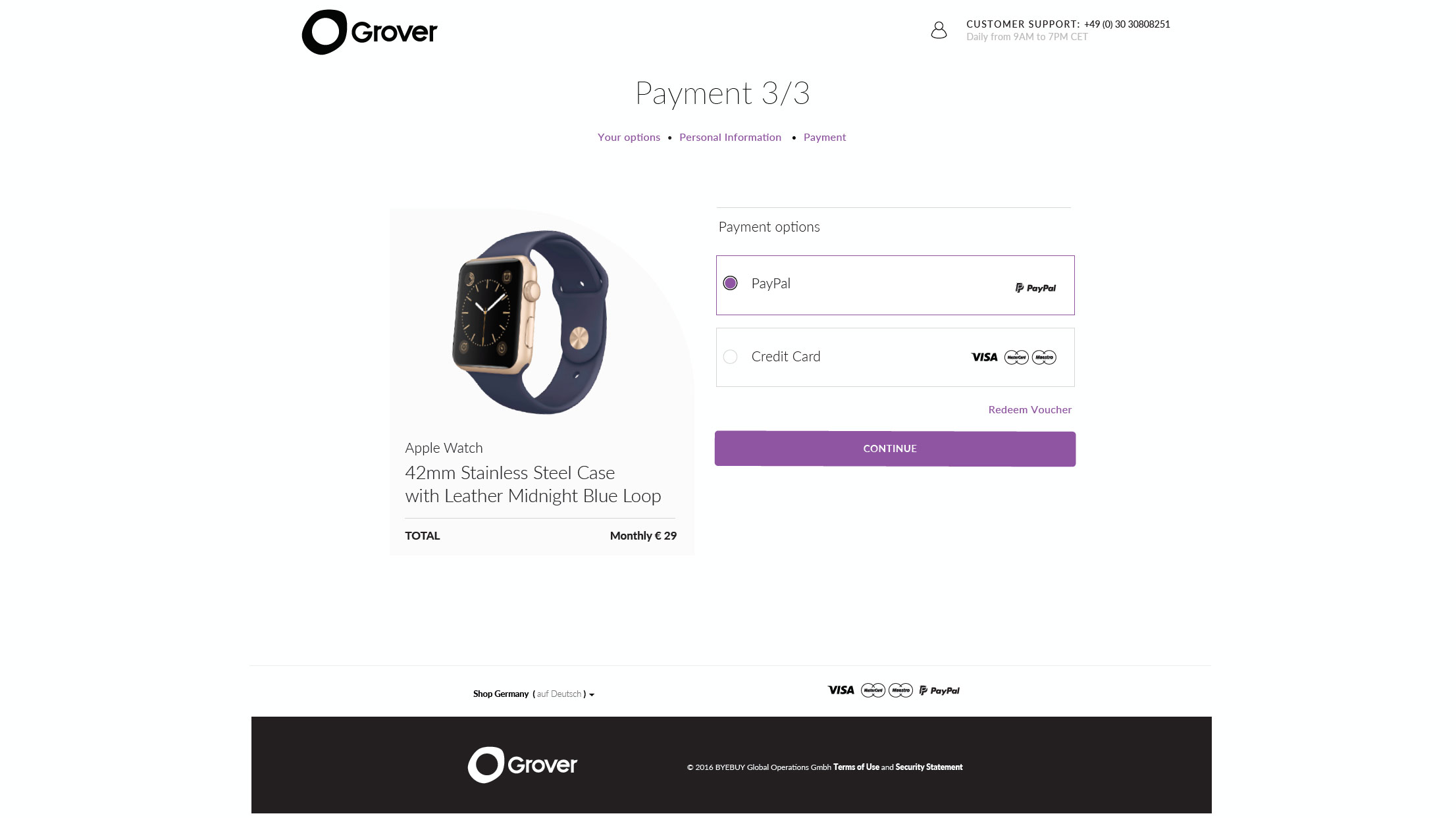
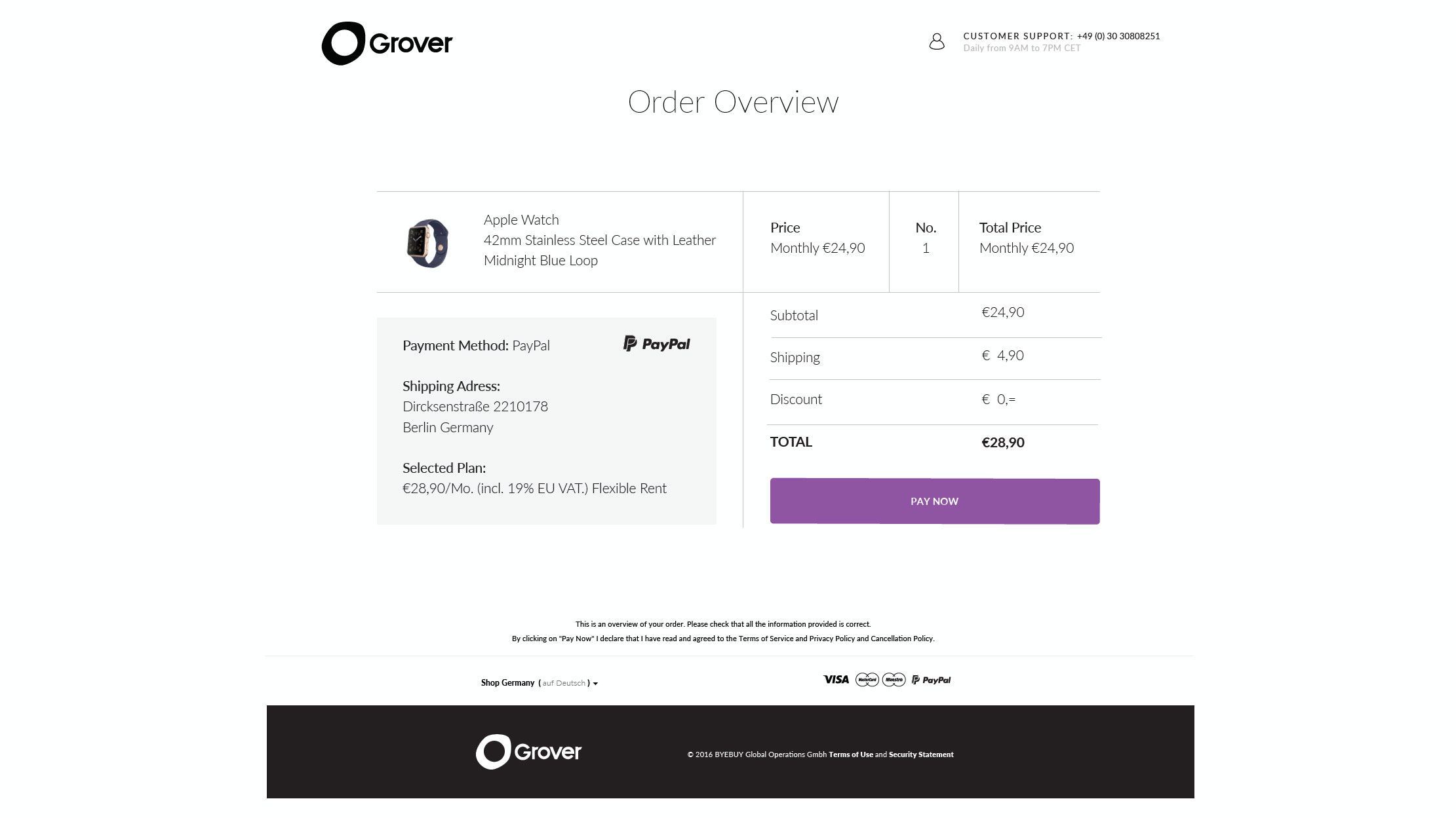
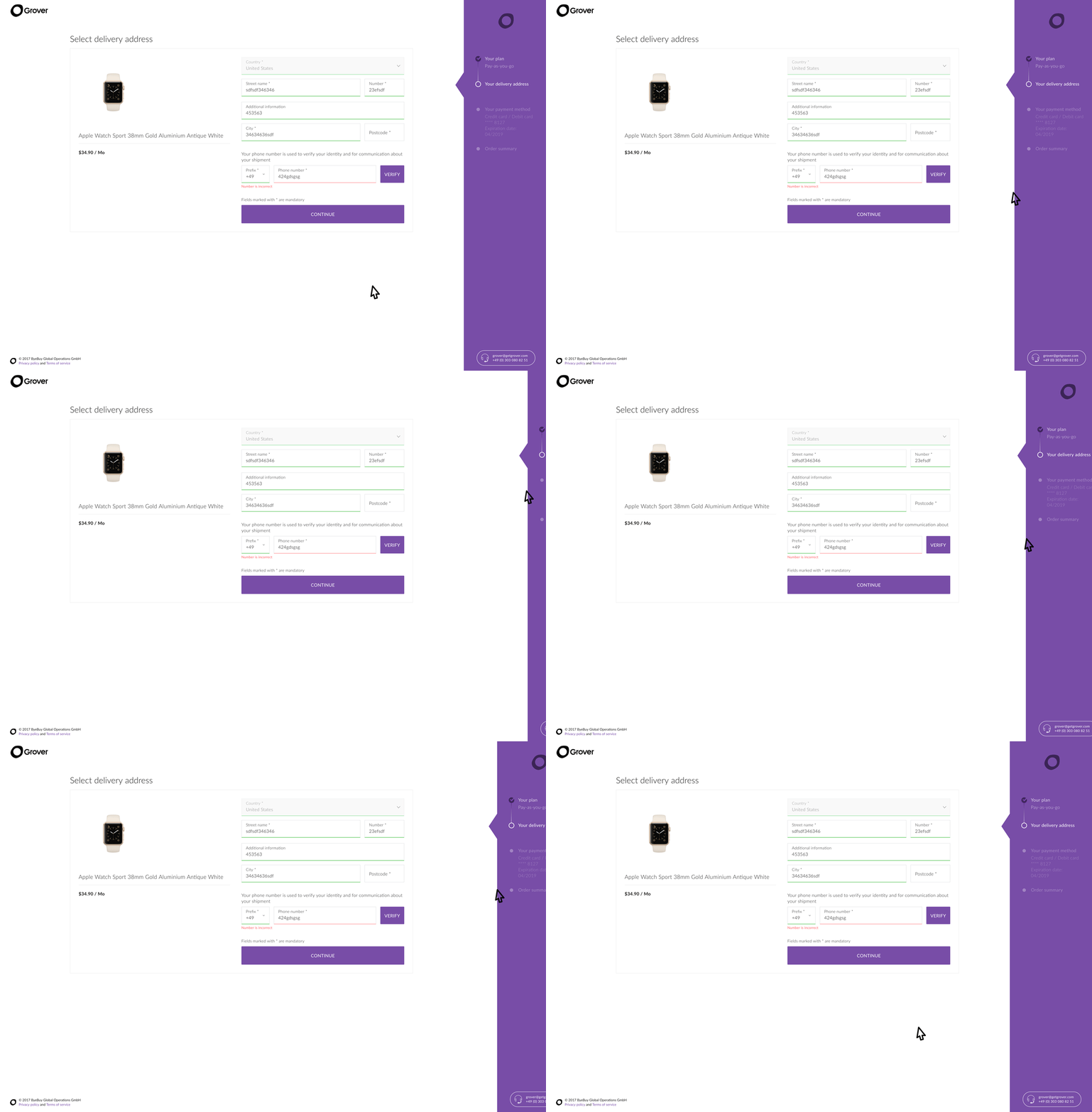
Immediately after, we looked in to the Check-Out Process.
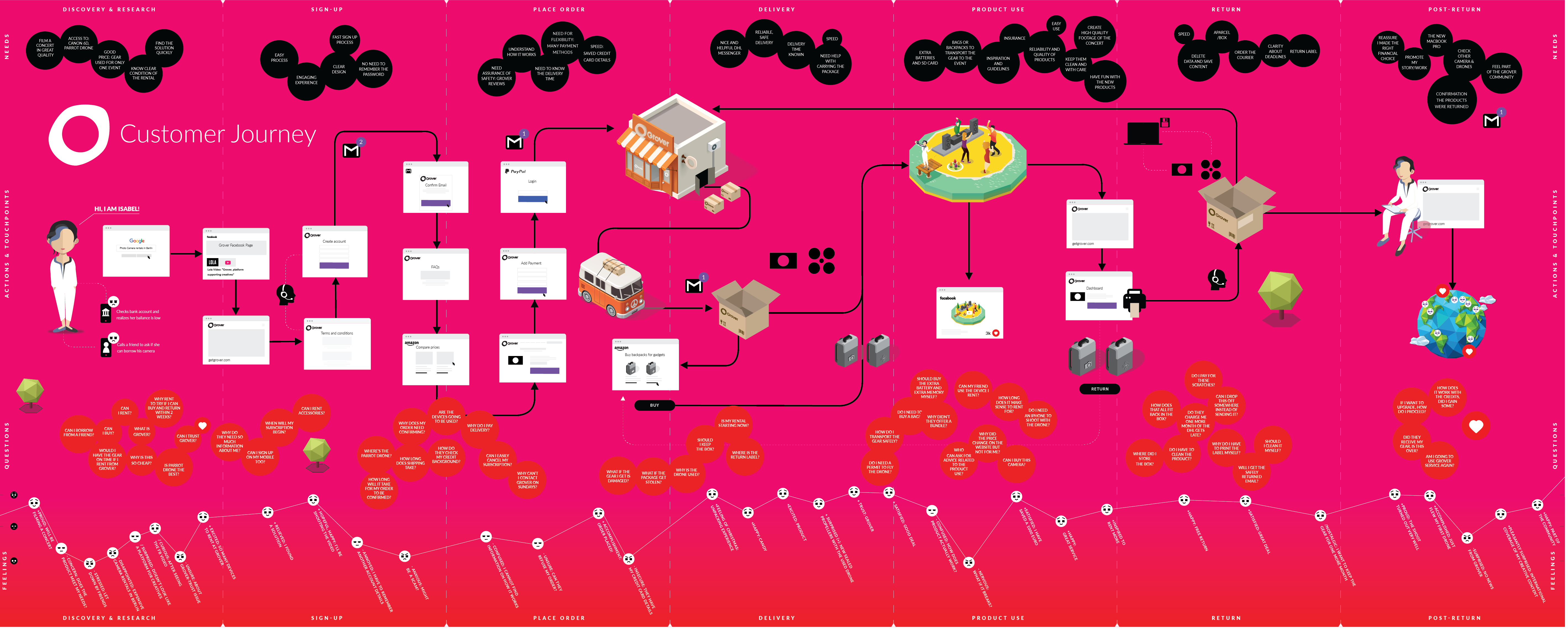
After we stabilized a bit the product, we run a Grover Service Process, interviews and process updates. Mapping opportunities and new business opportunities.
We decided to simplifuy the brand colors, and made sure we avoid brand conflicts in the future with the most famous MAGENTA owners.
Extra Blue
#007eff
Magenta Magma
#c62a41
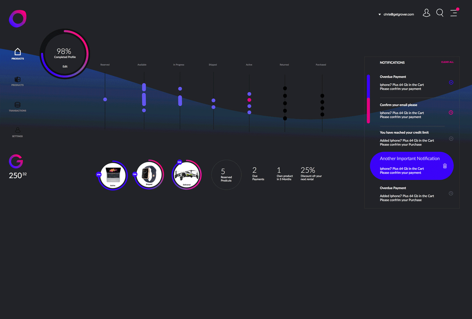
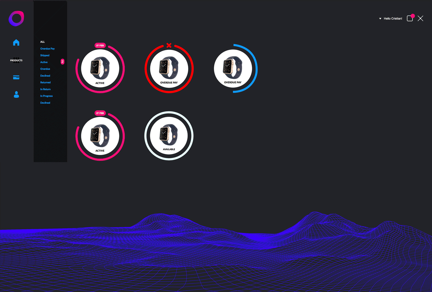
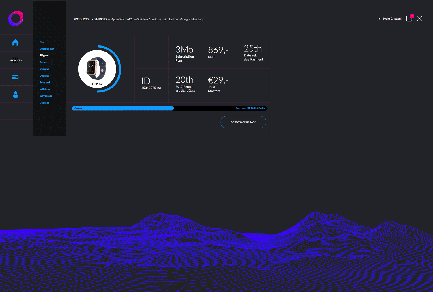
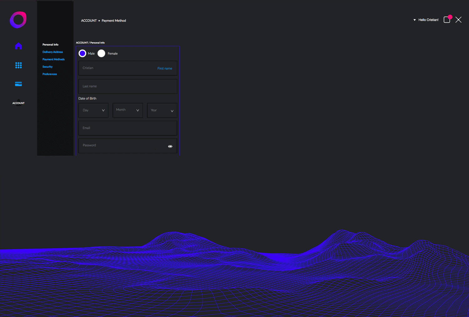
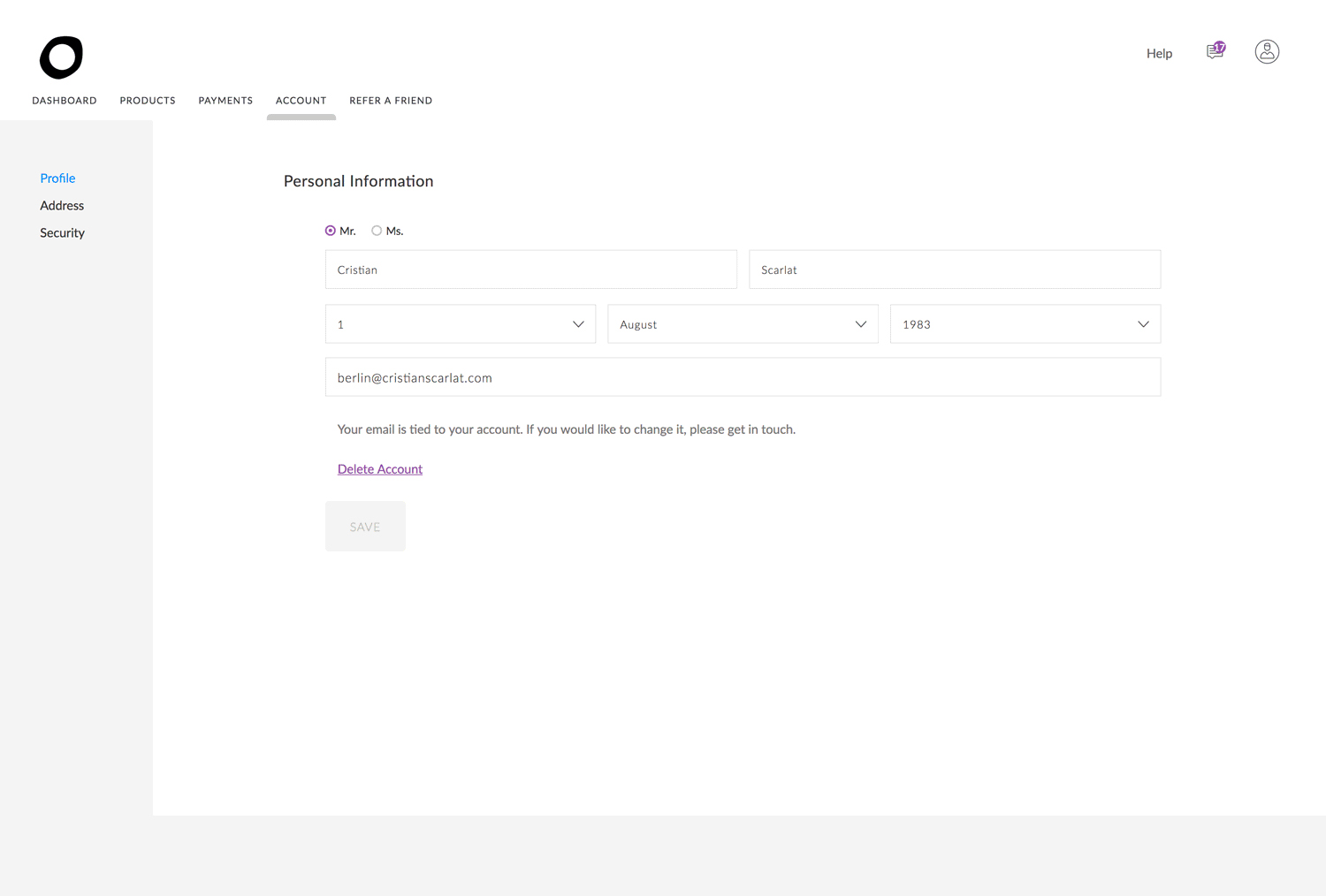
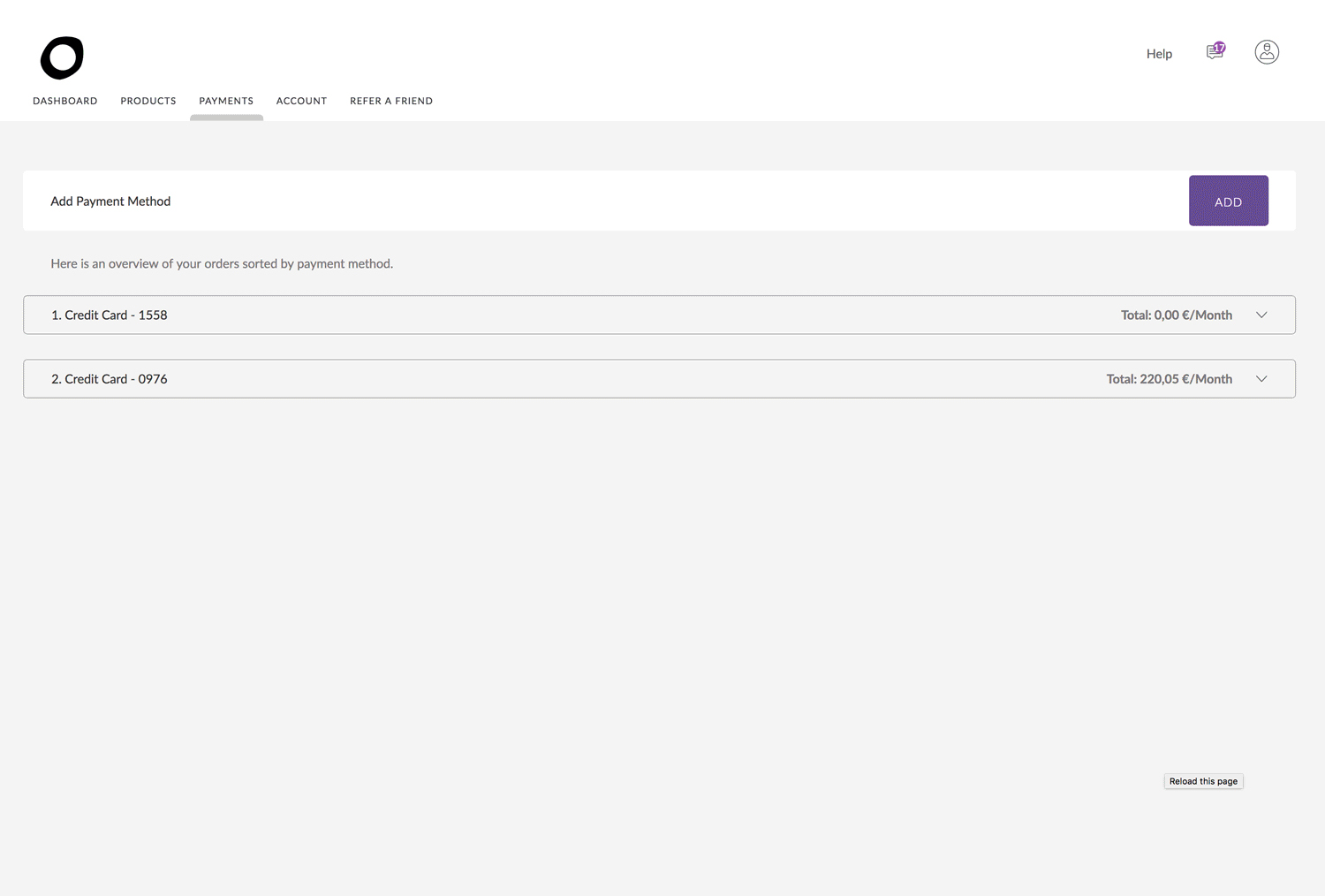
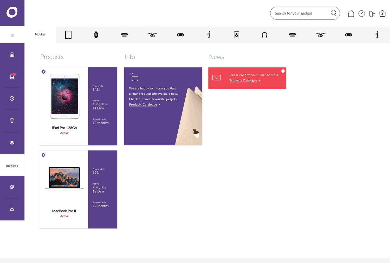
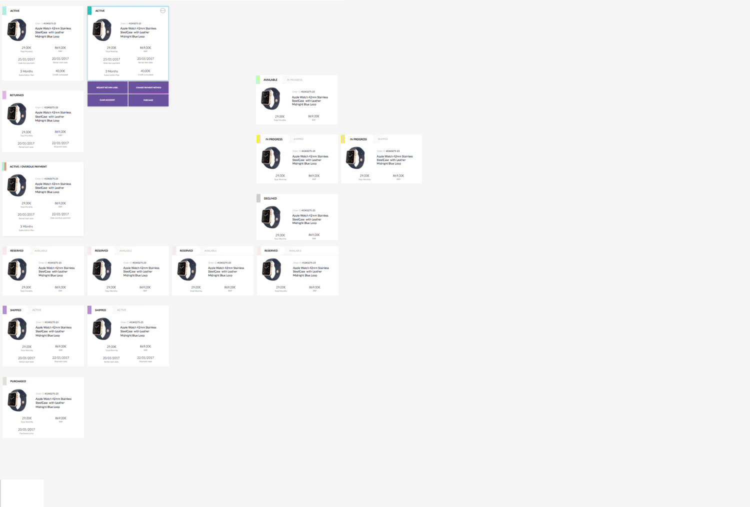
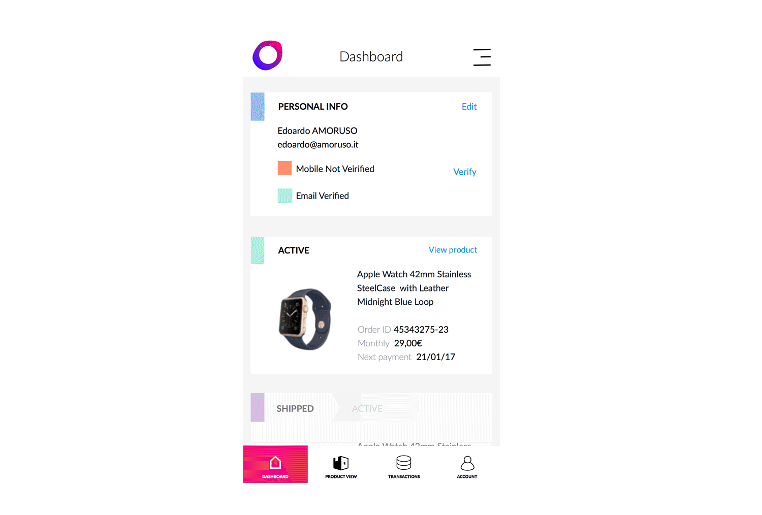
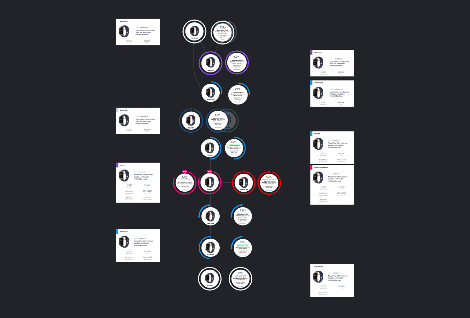
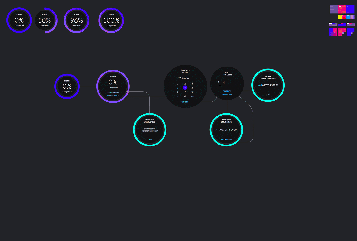
And started to work on rethinking and redesigning the dashboard.
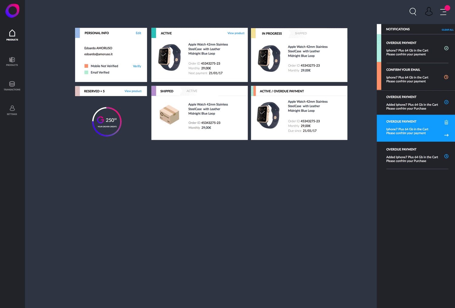

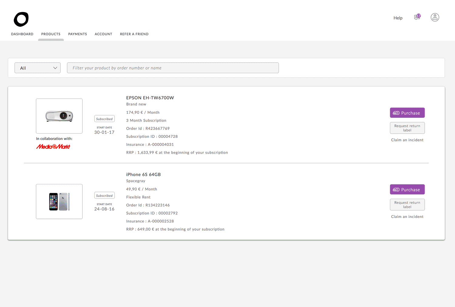
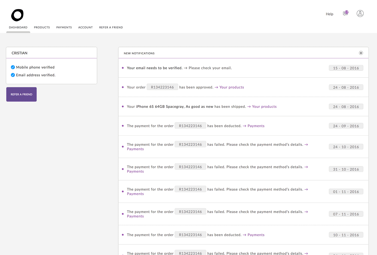
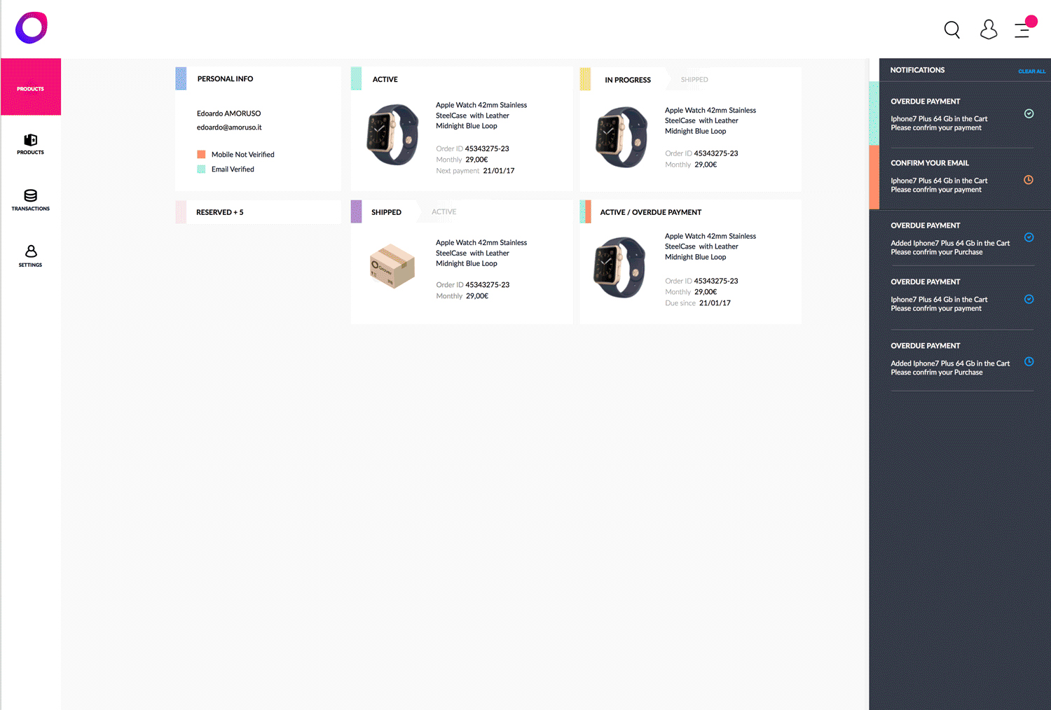


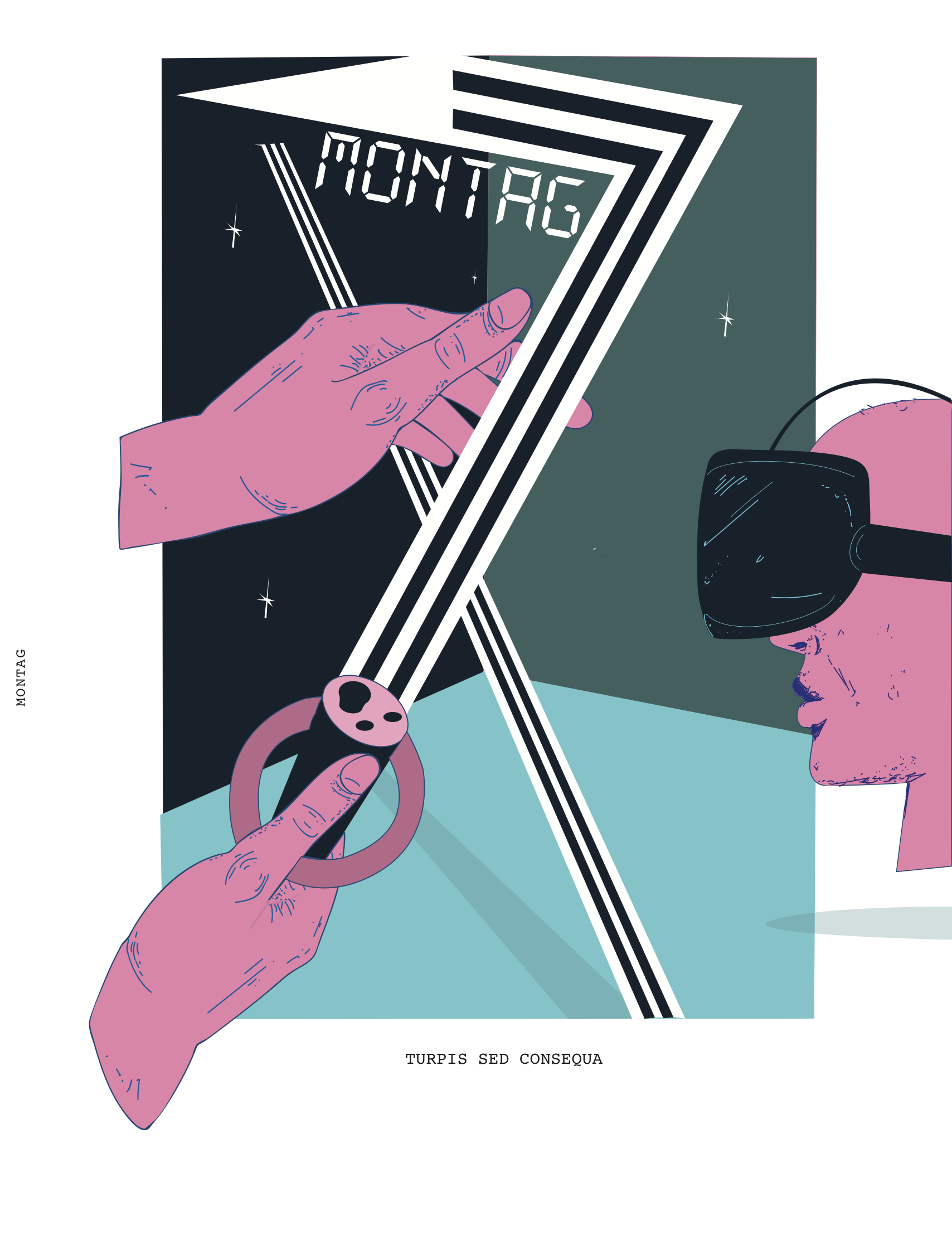
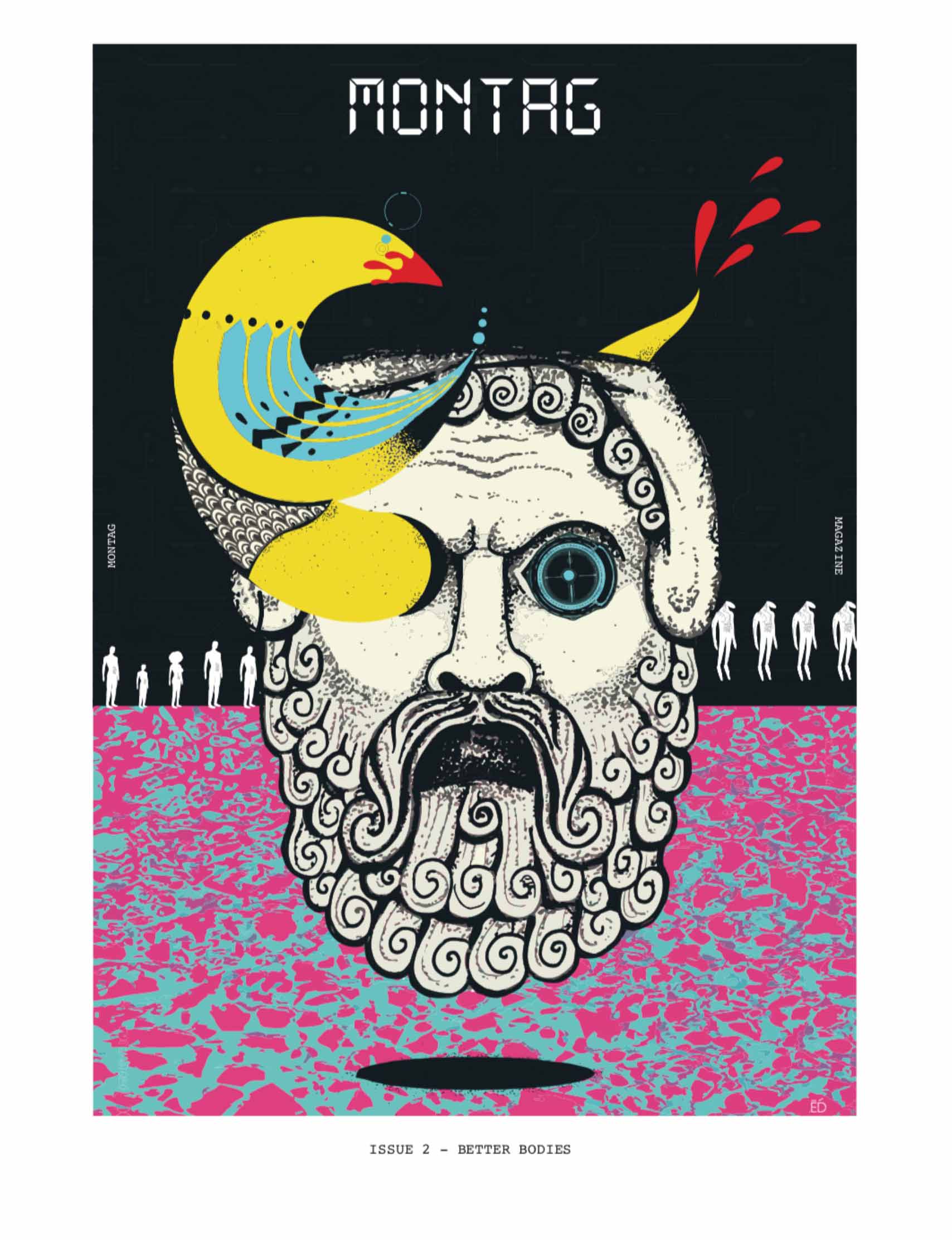
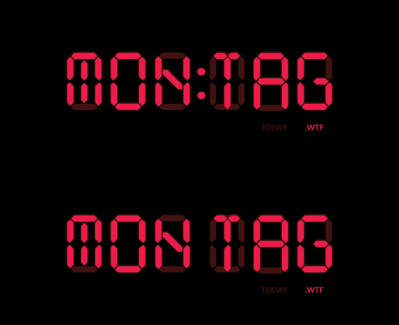
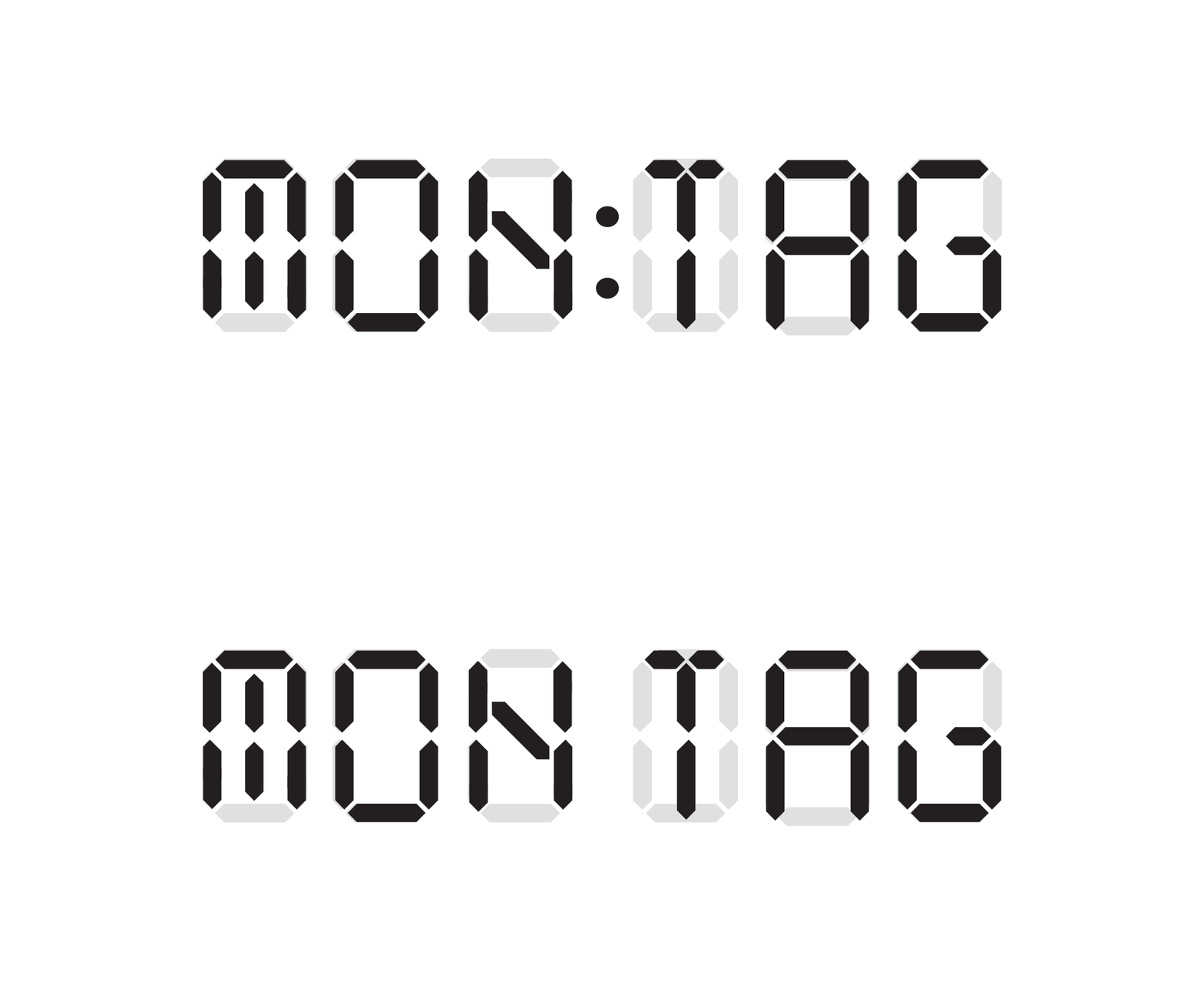
We came up with the idea to start a distopian magazine and createa a great cultural paralel project. A project that can have only one supporter, Grover. This is how MONTAG appeared.
And Grover 2.0
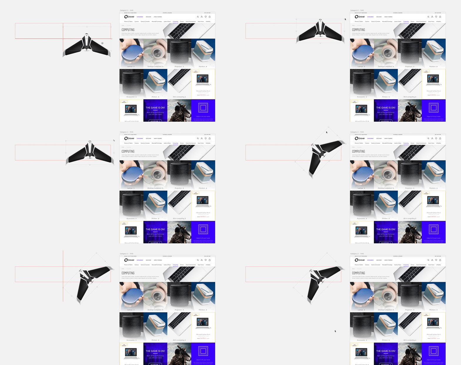
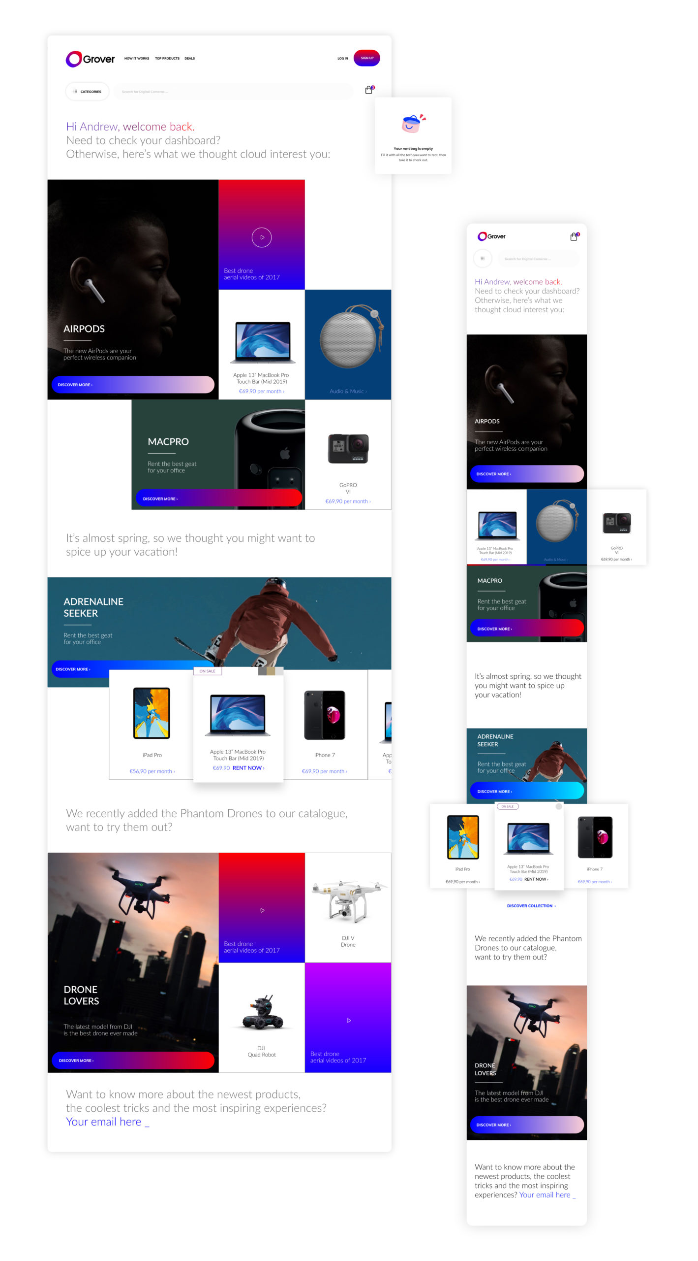
And then the new website mobile and desktop redesign.
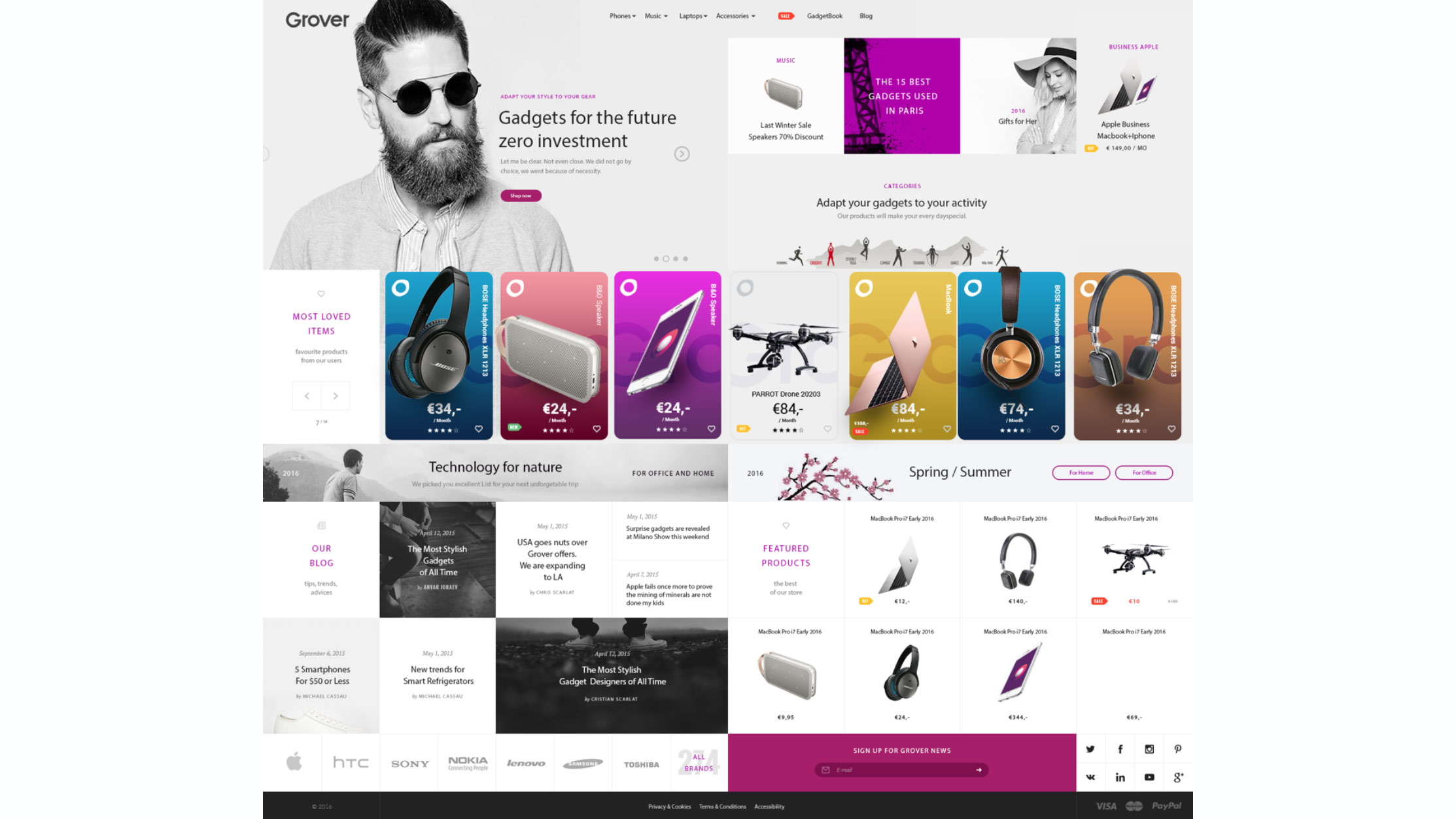
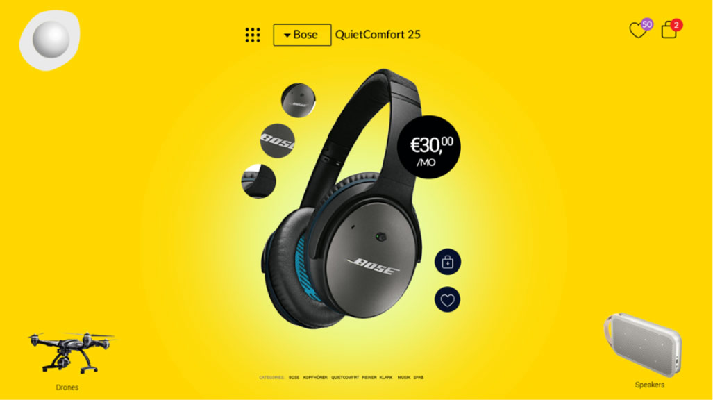
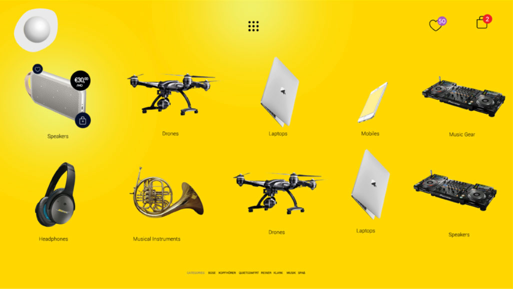
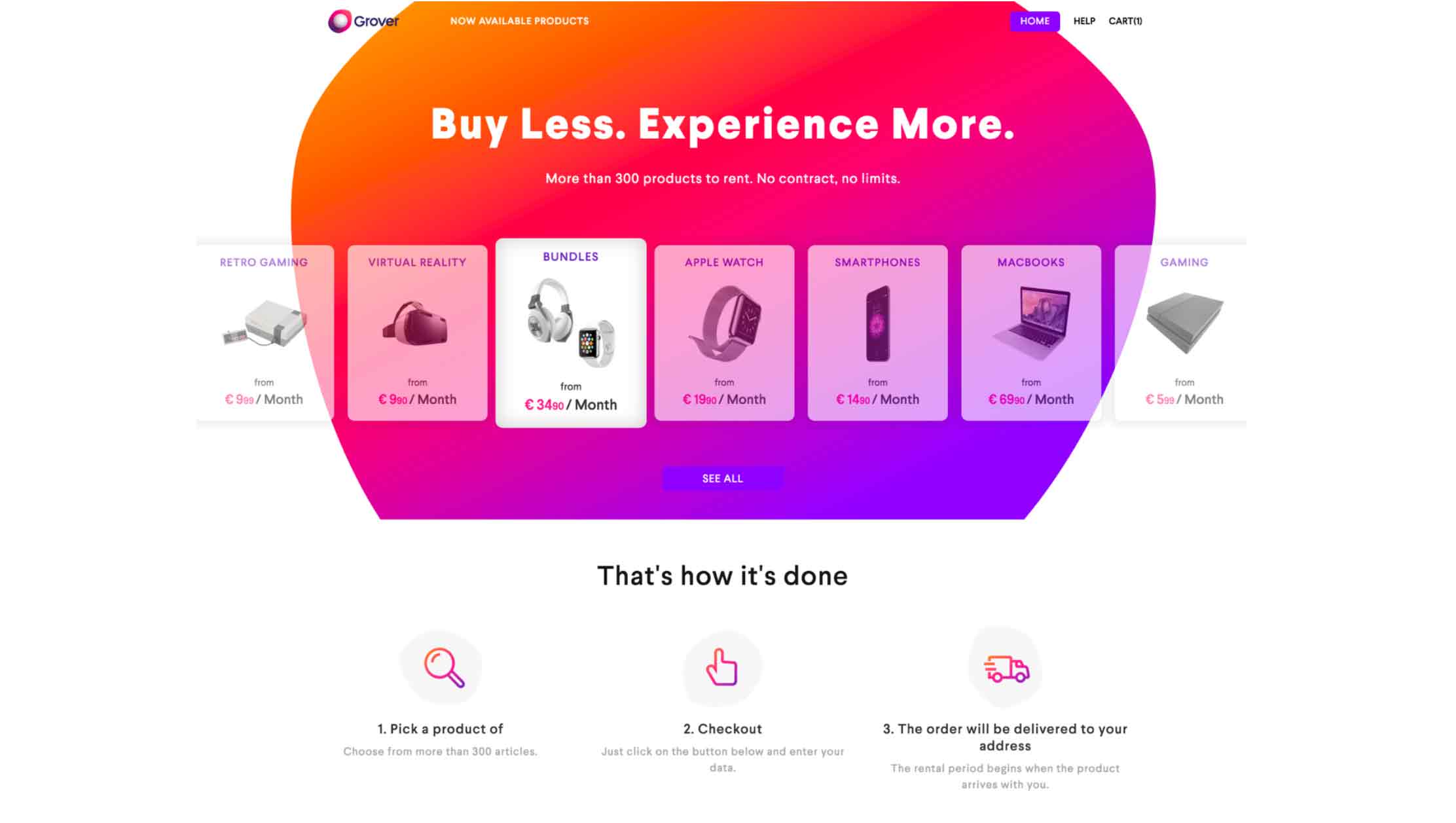
We had few concepts we developed in the first weeks in 2016.
And we decided to go on the idea of Fashion-Tech, rich content Gadgets-Lifestyle.
