The College of Extraordinary Experiences
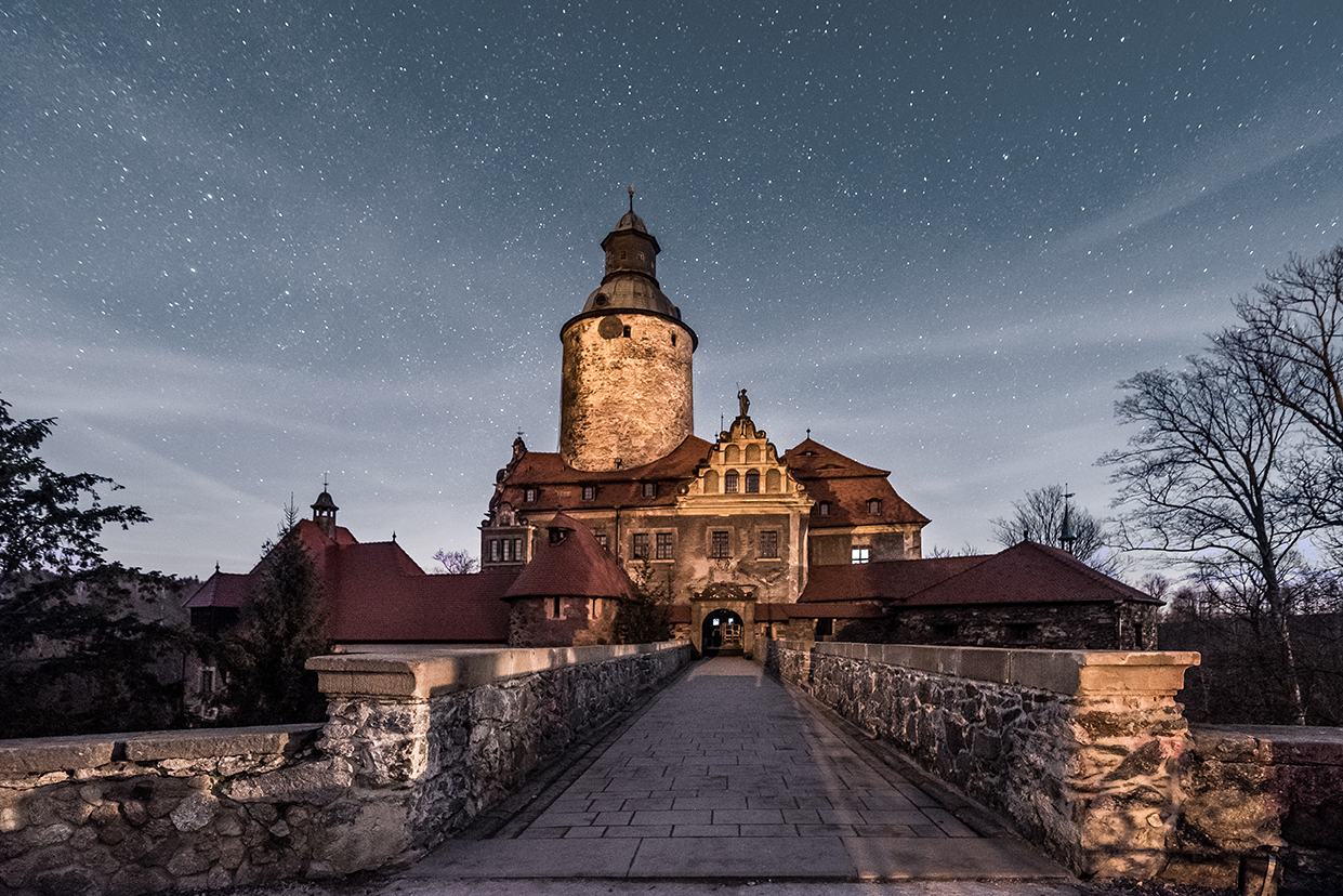
Location
Czocha Castle, Lesna, Poland
Deliverables
Creative Direction, Branding, Conference materials concept and production
Industry
Education, Events
Year
2015 — present

The College of Extraordinary
Experiences
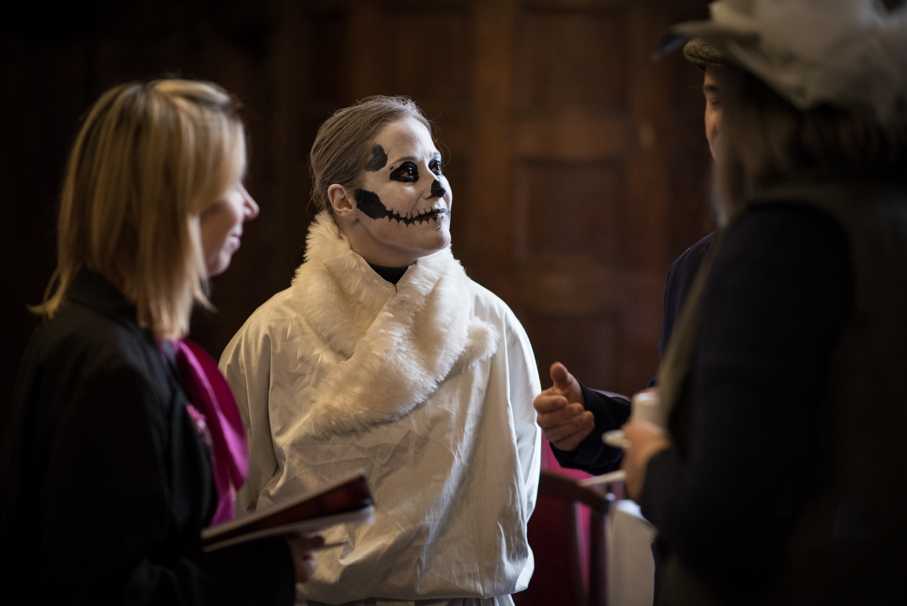
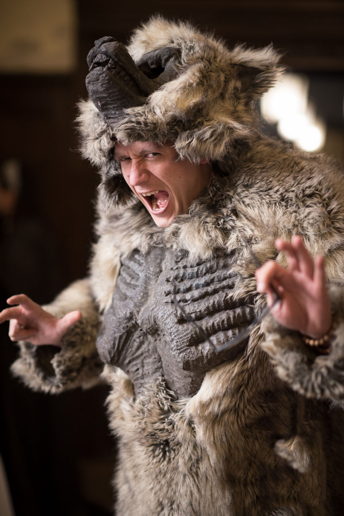
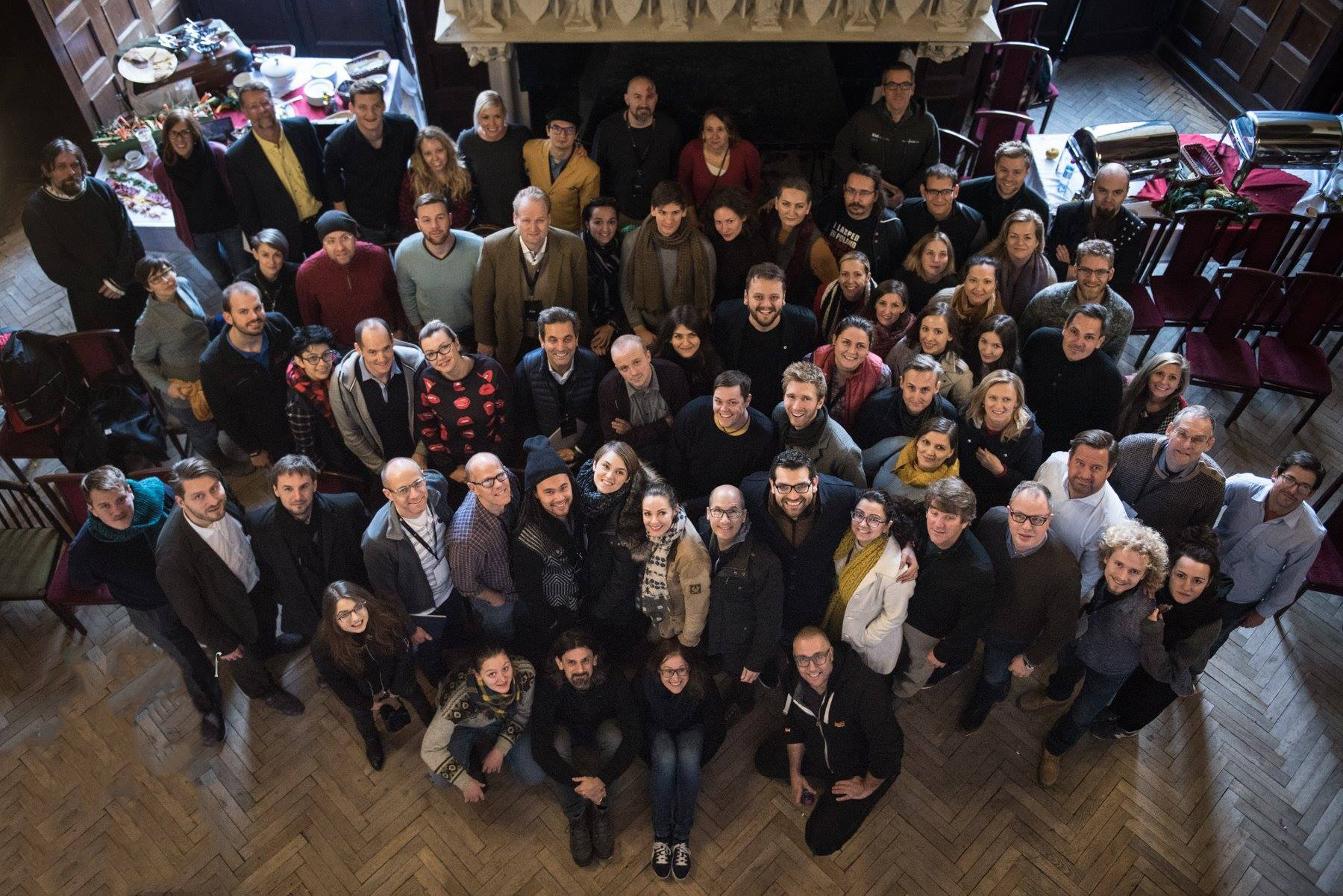
COEE is a one of a kind conference held in the unusual surroundings of Czocha, a 13th-century Polish castle. The College introduces an Immersive Education method to study experience design. We’re proud to have branded the conference and attended this amazing event where we did learn about experience design by practice.

The Trials
2017
The Logo
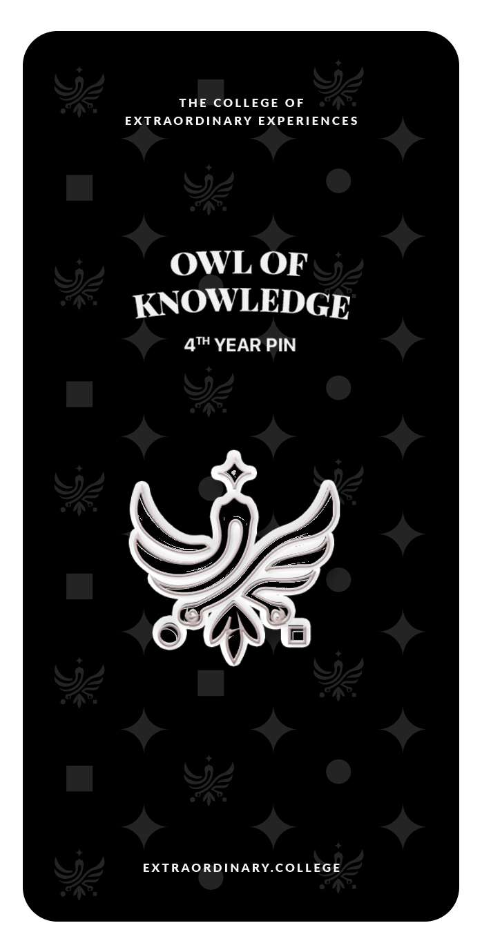
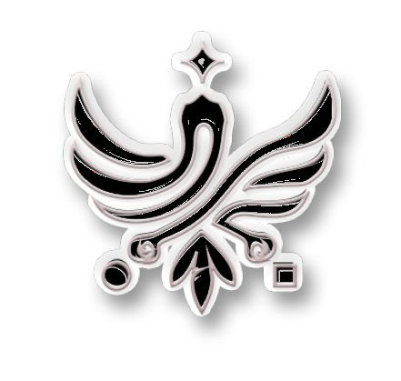
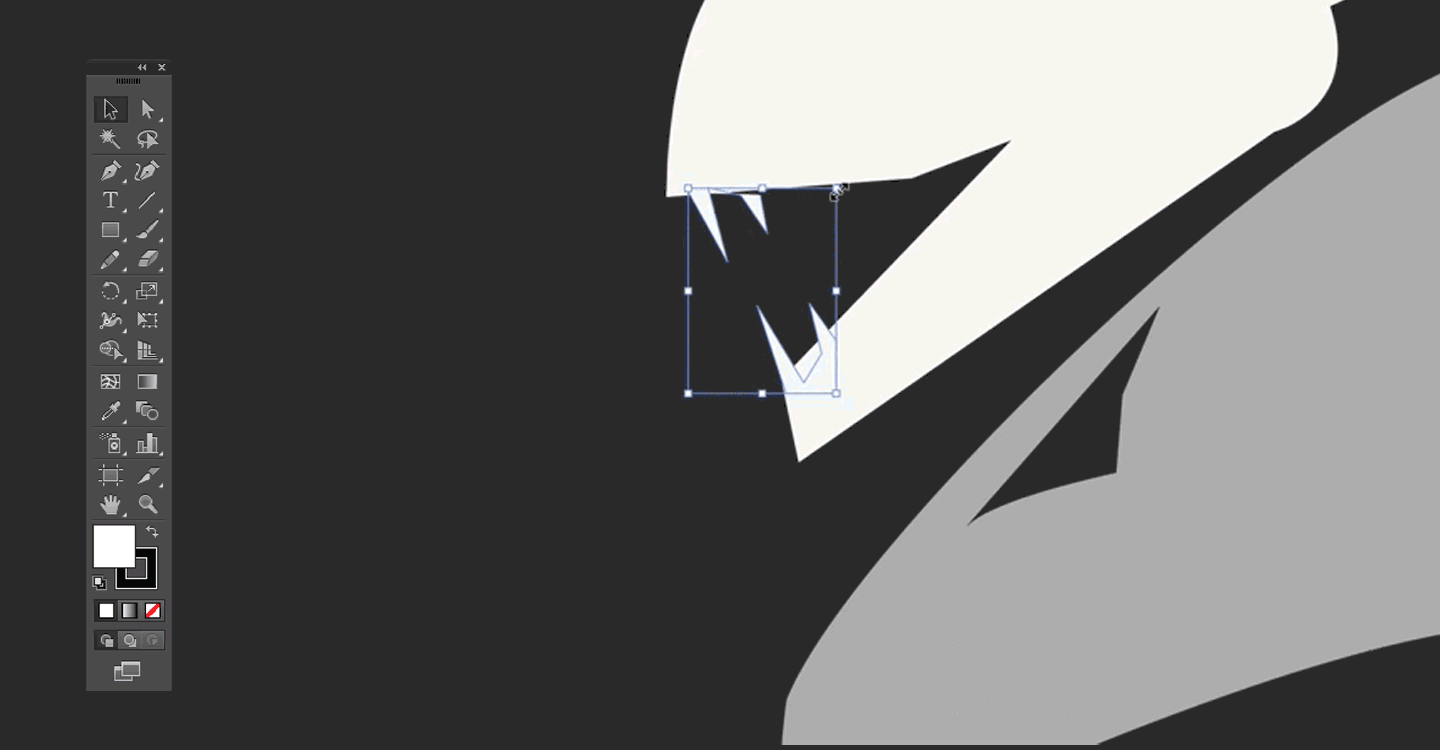
The owl in the logo stands for education, wisdom and magical powers. We adjusted the bird to match the perspective of the eagle in the national coat of arms of Poland, as the event takes place there, in an 12th century castle.

The Attack of The Hydra
2016
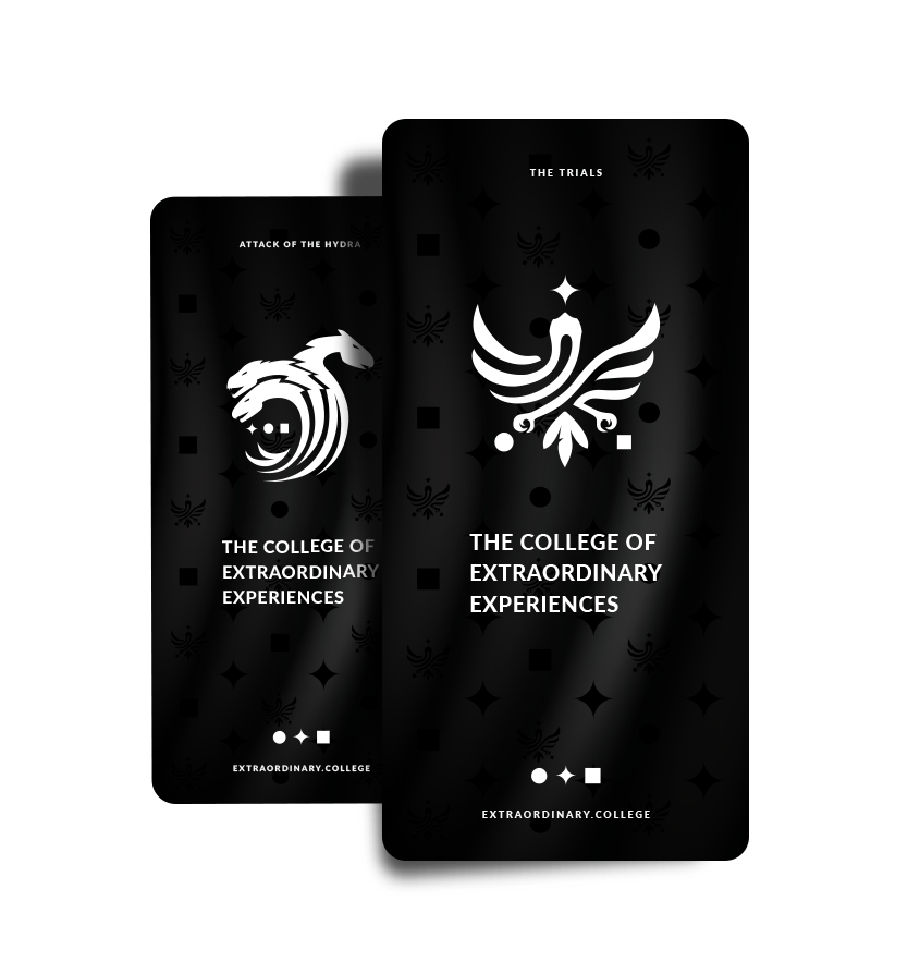
The Anti-Logo
The Anti-Logo represents a Hydra, a mythological creature with 3 dragon heads. In the context of the College, The Hydra stands for all fears designers have to face and conquer when staging experiences. It is meant the be the evil character of our story.
Four Editions,
Four Connected Brands
Every year, the organising team asked for a special logo to fit the theme of the event. 2015 (The Attack of the Hydra) 2016 (The Trials) 2017(The Tower of Transformation) 2018(The Call of the Wild).
The Attack of The Hydra
2016
The Trials
2017

The Tower of Transformation
2018

The Call Of The Wild
2019
The Colors
We chose the brand colors to fit its educational purpose yet be free from clichés. Black and white are dominant values corresponding to the elegant luxury, and high quality, while the Monza Red mostly as a necessity for having a call to action color in the digital word. Color stands for the innovative, fresh, dangerously passional character of The College of Extraordinary Experiences.
Black
RGB 0 0 0
CMYK 100 100 100 100
HEX #000
White
RGB 255 255 255
CMYK 0 0 0 0
HEX #FFF
Monza
RGB 204 10 21
CMYK 12 100 100 4
HEX #CC0A15
The Methodology
The brand values are the three symbols that the Owl of Knowledge is protecting from the Hydra of Destruction. The Hydra is trying to steal these elements in order to block us from being creative. The symbols stand for Flexible Focus, Co-Creation and Rapid Prototyping.

Co-Creation
Having a sandbox where everyone can contribute.

Flexible Focus
Shifting attention from detail to the big picture.

Rapid Prototyping
Pivoting based on feedback from last iterations.

P.E.R.M.A
Model of well-being by Martin Seligman.
The Map of the Czocha Castle
We had to make a map of the Czocha Castle. And this is our edition designed and printed for 2019th event.


The Cards
We had the idea to create some cards, to serve as Artefacts with unique quotes and inspiration from the teachers of the college. These cards can only be found in the castle during the event. We had 4 editions since 2016, and 4 collections of 100 different cards.


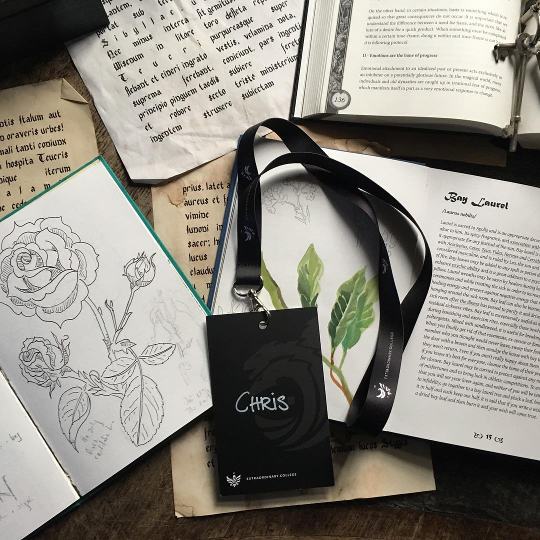
The Pin
If you are attending The College of Extraordinary Experiences, in the first three years you are recieving as a graduate the symbol pins, for the first year the Spark ( Co-Creation), for the second year the Circle Pin (Flexible-Focus), in the third year the Square (Rapid Prototyping). In the fourth year, the returning few graduates, got the Owl of Knowledge Pin. Only a small hand of people have this special pin, as they attended four editions of The College of Extraordinary Experiences.